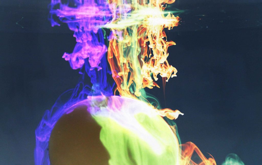
The colors in the image are really great. I think some of the details are lost in exposure of the bright colors. There is a lot of interesting things going on here, and it’s very exciting to notice it all.
Interesting choice to invert the colors. I do believe it is an improvement. I like the sharp focus on all of the little plume structures on the right side. I do think brightness could be brought down a little to recover some of the details however.
I really like the fluorescent colors of the flow here. Some of the reflections are a little bit distracting but with a little cropping these could be easily taken care of. Very nice work with the photo.
The colors in this image are excellent. There are a few specs of something floating on the surface that distract a little from the image, maybe consider editing them out in post processing. The flow is well lit and well focused, nice job.
I really enjoy the vibrant colors of the dyes. I like the balloon to change from the standard tank, because I like how you can see the dyes bend around the balloon.
This is cool, it almost reminds me of bright flames. Colors are a little blown out, would be nice to see a little more contrast. Love that you chose to add the sand balloon.
Nice clean crisp photo, I like the bright coloring, the negative effect isn’t even obvious at first. I like the coloring, the fluid flow is nice, clean, clear and crisp. This is a really lively photograph.
The negative filter makes the RT diffusion umbrellas look very hot. I like it! Some of the colors in the middle and on the top are a little over saturated.
Nice flow, the colours are nice, good decision to go with the negative. Did you consider darkening the image? There are a few saturated areas, and the background is a shade grey.
The diffusion is slightly out of focus. The contrast between each color is nice but a darker background could help that contrast. The way the colors are mixing on the object at the bottom is awesome.
Really nice colors presented in this image! I like the neon and vibrant of the colors and interaction of the different colors and marble at the bottom.
1. The image is artistically very interesting and cool.
2. The fluid physics are well shown.
3. The photographic technique is excellent- I like the post-processing negative effect.
20 Comments. Leave new
The colors in the image are really great. I think some of the details are lost in exposure of the bright colors. There is a lot of interesting things going on here, and it’s very exciting to notice it all.
Interesting image! The post processing that has been done on the image almost makes the dye or paint look like light refracting. Really cool image.
Interesting choice to invert the colors. I do believe it is an improvement. I like the sharp focus on all of the little plume structures on the right side. I do think brightness could be brought down a little to recover some of the details however.
I really like the fluorescent colors of the flow here. Some of the reflections are a little bit distracting but with a little cropping these could be easily taken care of. Very nice work with the photo.
The colors in this image are excellent. There are a few specs of something floating on the surface that distract a little from the image, maybe consider editing them out in post processing. The flow is well lit and well focused, nice job.
I really like the colors you used in the image and the fluids are well shown. The lighting is well done to bring out the observed phenomenon.
Really interesting interaction between the dye and the balloon.
I like how the image is in negative from the post processing. The flow can be clearly seen and is colorful.
I really enjoy the vibrant colors of the dyes. I like the balloon to change from the standard tank, because I like how you can see the dyes bend around the balloon.
This is cool, it almost reminds me of bright flames. Colors are a little blown out, would be nice to see a little more contrast. Love that you chose to add the sand balloon.
Nice clean crisp photo, I like the bright coloring, the negative effect isn’t even obvious at first. I like the coloring, the fluid flow is nice, clean, clear and crisp. This is a really lively photograph.
Great image!! I love the color It looks almost like fire!! A little bit blown out. I would like to see a darker background
The negative filter makes the RT diffusion umbrellas look very hot. I like it! Some of the colors in the middle and on the top are a little over saturated.
Nice flow, the colours are nice, good decision to go with the negative. Did you consider darkening the image? There are a few saturated areas, and the background is a shade grey.
Great neon looking colors. Cool texture in the fluid flow. There is a distinct difference in color which is interesting. Good lighting and focus.
The diffusion is slightly out of focus. The contrast between each color is nice but a darker background could help that contrast. The way the colors are mixing on the object at the bottom is awesome.
Really nice colors presented in this image! I like the neon and vibrant of the colors and interaction of the different colors and marble at the bottom.
Awesome colors!! I like the oranges you brought out a lot. Wouldn’t have thought this was a a negative at first, pretty neat.
1. The image is artistically very interesting and cool.
2. The fluid physics are well shown.
3. The photographic technique is excellent- I like the post-processing negative effect.
Art: Really awesome colors
Flow: Flow is clearly illustrated
Technique: Good lighting