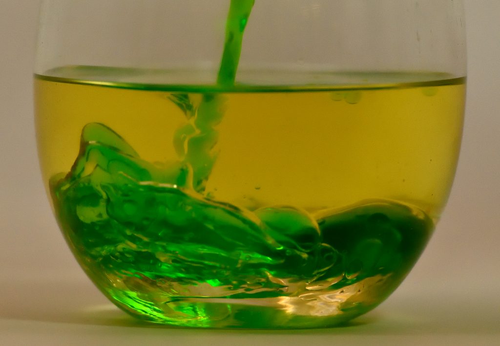
Really cool how the wavy instabilities appear when the green liiquid is being poured into the oil. Then it seems to have this coiling effect – but this is water!
The color contrast between the green and gold make for an aesthetically appealing image. It is interesting to see the two varying fluid viscosities mix together. Overall, really interesting image.
The contrast between the green and the gold makes for a nice dramatic visualization of the flow. The two fluids mixing are very distinct and it shows them well. I like that you can distinctly see each fluid, this makes it easy to see the flow and how the two are interacting with each other. The photograph is cropped well, technique is solid.
The flow regime in this image is vivid and stands out wonderfully. I think the distinction of fluid flow is apparent more so than most of the get wet submissions, great job!
This is pretty good, I really like the idea of coloring the water and having it shoot through the oil. Maybe a darker background and a bit more close up/cropping to this picture.
art: Nice composition and color choice. Blue might be pretty too!
flow: Neat! Cool to put the water into the oil, and the color helps.
technique: Nicely captured. The resolution seems a little low, or maybe just a small amount unfocused? The front of the glass is in focus and the bottom right is in focus, but the fluid flow itself seems a bit soft.
The lighting in this image along with the color choices makes for a nice aesthetic. Was it chosen to have the effect of the water building up on the egde?
I like the colors. The bright green combines extremely well with the more olive green. I think better lighting might improve this image a bit, but I think post-processing might detract from the image so I like how it is right now.
Great image and nice colors that clearly visualize the flow. The contrast or saturation of the image could be increased as the colors are a bit muted and washed out. Focus is great, exposure could have perhaps been decreased to increase contrast.
You captured the motion of the water nicely, and the composition and focus are spot on. Softer lighting might help with the brightness in the bottom of the glass, but otherwise a nice image.
Good choice of green for the water. I like the refraction at the top of the oil. I think there is a bit of motion blur so changing the shutter speed might help that.
I like the lighting and the contrasting colors of the oil and the water. The way that the water seems to almost ‘wrinkle’ at the bottom of the glass is very interesting.
I really like the colors. The flow is really satisfying too. I like the murkiness of the bottom too.
I would only try adjusting the light on the bottom.
Art
Nice choice of colors. They compliment each other. I like the textures.
Flow
The meandering of the stream from the surface is pretty cool. You captured this turbulence mixing really well!
Photographic Technique
Nicely done! It looks like you could have used a slightly larger depth of field, some details on the left are a little blurry.
I really like the choice of colors and it was an interesting twist pouring the water into the oil as opposed to the other way around. The turbulence is visible and it causes this “rush” effect which is really nice. The light in the bottom right almost makes it seem like the image itself is all under water
Sweet flow. The colors are great too. Reminds me of the Oakland A’s. If the lighting was more intense through the flow the image would pop even more. Nice capture.
I like how you can see all the different fluid flow as the water flows from the top to the bottom. The waves at the bottom are really nice, especially bringing out different shades of green. I would maybe even dye the oil a different color to provide more contrast. Nice image overall.
Good color choice, highlights the image.The flow is clear and shows different stages, the bottom of glass is a little distracting. Overall great image.
I like how you decided to color the water before pouring it into the oil. Try to play with focus a little bit more to get better contrast. Lighting and background are good.
The texture of the fluid and the colors of this image play together nicely. The physics are clearly present and are interesting, since the flow is stable.
The turbulence in the water and the colors of the different fluids really stand out in the glass. The mixing of the fluids emulate glass-like qualities.
44 Comments. Leave new
Really cool how the wavy instabilities appear when the green liiquid is being poured into the oil. Then it seems to have this coiling effect – but this is water!
The color contrast between the green and gold make for an aesthetically appealing image. It is interesting to see the two varying fluid viscosities mix together. Overall, really interesting image.
The contrast between the green and the gold makes for a nice dramatic visualization of the flow. The two fluids mixing are very distinct and it shows them well. I like that you can distinctly see each fluid, this makes it easy to see the flow and how the two are interacting with each other. The photograph is cropped well, technique is solid.
The flow regime in this image is vivid and stands out wonderfully. I think the distinction of fluid flow is apparent more so than most of the get wet submissions, great job!
Great flow! The colors are very nice and I love how glossy the fluids feel!
I think a darker background could be helpful, but I really like the way the green water contrasts with the oil. Great focus as well.
This is pretty good, I really like the idea of coloring the water and having it shoot through the oil. Maybe a darker background and a bit more close up/cropping to this picture.
art: Nice composition and color choice. Blue might be pretty too!
flow: Neat! Cool to put the water into the oil, and the color helps.
technique: Nicely captured. The resolution seems a little low, or maybe just a small amount unfocused? The front of the glass is in focus and the bottom right is in focus, but the fluid flow itself seems a bit soft.
The color choice is nice, the green with the oil works well. I like how it is water in oil too instead of the other way around.
The lighting in this image along with the color choices makes for a nice aesthetic. Was it chosen to have the effect of the water building up on the egde?
Very nice flow and moment. Maybe try a different angle of adjust the lighting so that the green fluid flow is more of the center of attention
I like the colors. The bright green combines extremely well with the more olive green. I think better lighting might improve this image a bit, but I think post-processing might detract from the image so I like how it is right now.
The focus and colors make the fluid separation very obvious. It is interesting that the water squiggles as it enters the oil.
Great image and nice colors that clearly visualize the flow. The contrast or saturation of the image could be increased as the colors are a bit muted and washed out. Focus is great, exposure could have perhaps been decreased to increase contrast.
Great piece, I actually like how the lighting worked out. The colors work well and the flow can be seen well.
You captured the motion of the water nicely, and the composition and focus are spot on. Softer lighting might help with the brightness in the bottom of the glass, but otherwise a nice image.
I like how the colored water behaves in the vegetable oil. Nice color choice for your colored water.
Good choice of green for the water. I like the refraction at the top of the oil. I think there is a bit of motion blur so changing the shutter speed might help that.
I like the lighting and the contrasting colors of the oil and the water. The way that the water seems to almost ‘wrinkle’ at the bottom of the glass is very interesting.
I really like the colors. The flow is really satisfying too. I like the murkiness of the bottom too.
I would only try adjusting the light on the bottom.
Art
Nice choice of colors. They compliment each other. I like the textures.
Flow
The meandering of the stream from the surface is pretty cool. You captured this turbulence mixing really well!
Photographic Technique
Nicely done! It looks like you could have used a slightly larger depth of field, some details on the left are a little blurry.
I really like the choice of colors and it was an interesting twist pouring the water into the oil as opposed to the other way around. The turbulence is visible and it causes this “rush” effect which is really nice. The light in the bottom right almost makes it seem like the image itself is all under water
Sweet flow. The colors are great too. Reminds me of the Oakland A’s. If the lighting was more intense through the flow the image would pop even more. Nice capture.
I like how you can see all the different fluid flow as the water flows from the top to the bottom. The waves at the bottom are really nice, especially bringing out different shades of green. I would maybe even dye the oil a different color to provide more contrast. Nice image overall.
The lighting in the bottom of the glass confuses the flow. I wonder if the resolution would improve with a faster shutter speed.
Good color choice, highlights the image.The flow is clear and shows different stages, the bottom of glass is a little distracting. Overall great image.
Good use of colors to distinguish flow. Framing works well and good definition.
Cool use of green and yellow. I might add some other colors or a larger imbalance of fluids. Also, take down your ISOs, it makes it look a bit grainy.
The lighting in this image is great. I like the contrast of the green colors. Getting the pouring of the liquid in the picture is awesome.
Colors are nice, cropping is good too. The flow is well-defined
I like how you decided to color the water before pouring it into the oil. Try to play with focus a little bit more to get better contrast. Lighting and background are good.
The gradient of green on the gold work well together. The image is simple and the stream turbulence give the fluid life.
The texture of the fluid and the colors of this image play together nicely. The physics are clearly present and are interesting, since the flow is stable.
The color choices work well together. The highlights and shadows make the water really stand out and I like how the oil looks flat.
Nice choice of colors and focus. I like how you captured the flow by pouring the water into the olive oil rather than the opposite.
The composition of this image is well done, the focus is also nice. I would like to see the light on the bottom going through the whole glass.
Very nice picture and it is pleasing to look at! Great demonstration of the flow.
Love the phenomena happening in between the water and oil. Cool color of the oil and good focus.
Very interesting picture, very colorful. Good focus, exposure and timing. Flow is understandable. Good choice of color
I like the color choice. The flow from the water pouring into the oil is really nice but I think could be highlighted more.
The flow type is very obvious. If I were to show someone an example of turbulent flow, I would show them this photo
Would be better if the image was more clear. Like the colors and concept of the image
I like the lighting and how it gives the flow some depth. Nice framing and use of colors to make the water pop
The turbulence in the water and the colors of the different fluids really stand out in the glass. The mixing of the fluids emulate glass-like qualities.