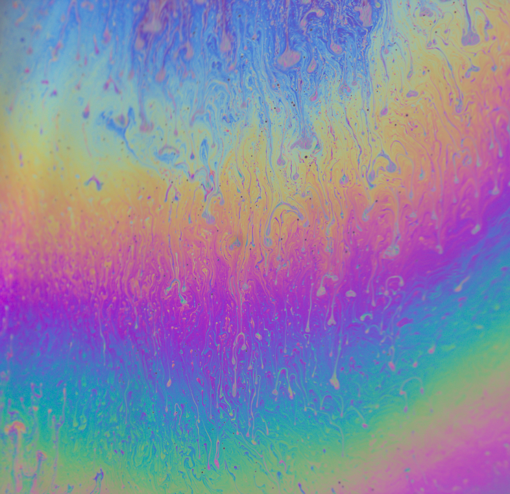
Soap film experiences thin film interference and creates a gorgeous rainbow.
Thin film interference is when the light waves reflected by the upper and lower bounds of a very thin film (the soap in this case) interfere with one another which can either enhance or reduce reflected light. Since the soap film has a non-uniform thickness (due to gravity and the weight of the soap pulling down on itself), we see a gradient of color.
8 Comments. Leave new
This image is extremely surreal and I love it. Didn’t know thin film was the only thing that was required for this effect. Also your color editing is amazing, it’s a perfect pastel rainbow.
This photo at first glance really grasps my attention, theres a lot going on with the colors and swirls and leaves me curious and amazed that this is real. I also really like how the photo includes the entire spectrum of the rainbow and more.
I think that the central focus of the film is really cool and draws my focus in towards the center of the image and the specific flows going on there. I also think that the coloring is cool and dramatizes how the light refracts differently as the fluid thickness varies. As stated, my only opinion would be to have a behind the scenes photo of your setup as its not immediately apparent from the image itself.
To answer your question about over-saturation, I do not think you over-saturated the image. As opposed to a landscape or a portrait in which over-saturation will make the image look unnatural, this image is non-representational and the vibrant colors make the image beautiful.
What focal length did you use for this image?
Artist Question: Was the editing of the colors make the picture look unnatural (too much)? What is your favorite part about it?
I do not think the colors make anything about this look unnatural. The vibrant colors add to the draw and beauty of this photo, having less color would take away from the brilliance of it, I really enjoy this photo.
My favorite part about this photo is the dripping of other colors into the other ones. There is some blue/gray in every section really tying it all together, every color is slightly mixed into each other and it bring the whole photo together.
This image reminds me of cotton candy or being at a fair. I really like how many colors are present in the image, it was cool to hear that it is at the end of the bubble’s life-cycle. I think the dripping of different colors into each other makes the image look more ‘natural’ and brings you back to reality.
The way that you keep the lighting soft, light, and artistic and at the same time are able to capture the detail in the soap film is awesome; it’s tricky to keep reflections out and you did that very well!
The color in this picture is really eye catching. The way you were able to avoid any glares or reflections was really impressive, and the blurring around the edges kind of softens the image and really adds to the beauty.