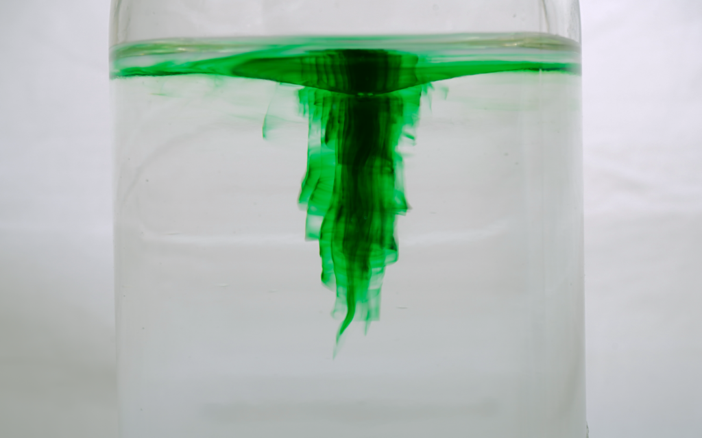
A vortex in water, using green food dye. To achieve this, a milk frother was used to create a vortex, then a single drop of green food coloring was dropped into the center of the vortex. The green coloring highlights the circular motion of the fluid as the vortex tunnels downward in the jar, remaining primarily in the funnel.
Assisted by Kelsie Kerr
View the full report here
7 Comments. Leave new
I think you did a really nice job executing the experiment, the amount of dye in the water is enough to see the contrast in the water as well as the darkness to show the vortex’s shape. I really like how the tip of the vortex is really sharp, and if you flip it upside down it almost looks like a green flame which is really dope.
I think the background and lighting you used was excellent, and the contrast that it provides with the harsh lines of the food dye in the vortex really demonstrates the fluid layers and different pressures. I like the cropping and think that it gives a dramatic focus, but it would be interesting to consider and experiment with other cropping and framing.
I really like the lighting that you decided to use to capture this! It is nice and soft and really emphasizes what is happening in the jar without being too overpowering.
The dimple at the top of the surface adds to the image’s aesthetics as all the color in the image draws you into the middle of the vortex.
The image reminds me of a fairytale. The green vortex seems like a villain is going to pop out of it. This was accomplished really well because of the stark contrast between the super dark center of the vortex and the white background. The vibrancy of the ‘curtains’ also shows the contrast with the background well. The cropping looks like a movie screen and I think this helps to create the image.
I really liked the contrast of the green dye with the white background. It looks like a professional background/photography set up, the lighting was great. I also enjoyed how clear the fluid was besides the food dye, it could’ve gotten very murky with multiple takes.
I like the “curtains” of color that are around the vortex and the little tendril that is reaching out of the bottom. I think the dye really shows a lot of components of the vortex that wouldn’t be visible without the dye. I also really like the contrast of color in this photo, from the white background to the bright greens and darker greens in more concentrated areas.