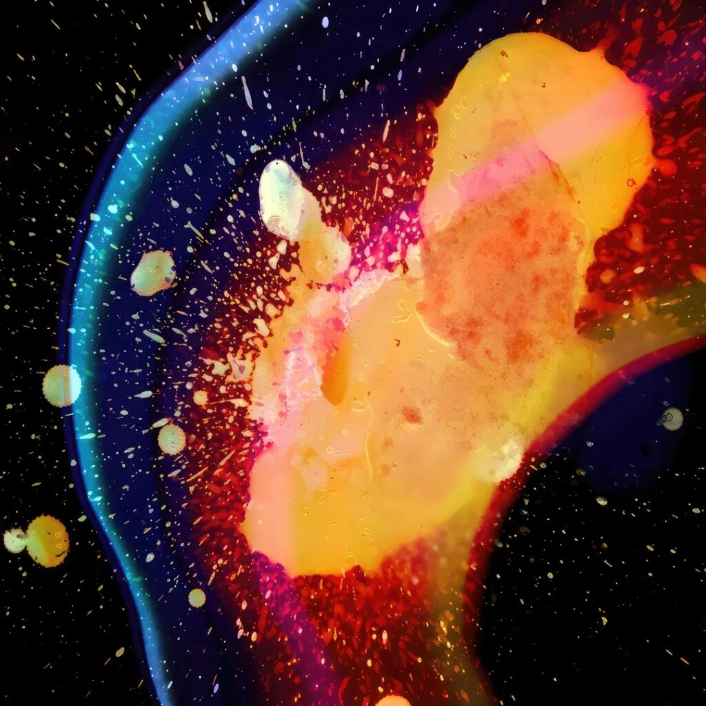
Known for his diverse artistic range and unique collaboration with music, Stanley Donwood, is by far one of my favorite modern English artists. And specifically, in my eyes, his work on Radiohead’s In Rainbows album is one of his greatest pieces. Shown above, the jarring clash of colors and ink quite literally explode from the page. Stanley Donwood, used hot wax and ink pushed through dense liquids and thrown at black glass panes to acquire the effect. Donwood would create this art while in the studio while the band recorded, trying to emulate the sound and mood of the music through his art. This is not the only picture captured during his collaboration, many different tiral images were taken, however this on was decided to represent the album.
Stanley Donwood’s Personal Website: https://www.slowlydownward.com/
Article artibuting him to the work of In Rainbows: https://peoplesgdarchive.org/item/13769/in-rainbows-album-cover
7 Comments. Leave new
Second Prize – I think this is one of the more visually stunning images in this assignment. The almost iridescent effect achieved is spectacular.
First Prize:
I really enjoyed this example of flow visualization as it was not what I would have thought of initially when talking about flow visualization. However upon further review it’s a really powerful image in showing how diverse flow visualization can really be.
Second Place. This piece deserves recognition for the thoughtful execution and creativity behind it. The image captures a moment of fluid motion with striking precision, where form and structure emerge naturally from the physics at play. The choice of colors, lighting, and timing all contribute to an image that feels both scientific and artistic. Beyond the visual appeal, it demonstrates a strong grasp of the experimental process, showing patience in setup and restraint in editing.
First Prize: One of my favorite artists is Jackson Pollock which the splatter effect of this image portrays. I think it demonstrates a lot about fluid movement and almost looks like a nebula.
Second Prize: I’ve seen this album cover so many times but I never realized it was a flow visualization! Reading more about the creation of and motivation behind this piece was really cool and I think it stands alone as a great flow vis.
First prize: I feel that this piece really represents the art of flow vis. This album by radiohead is one of my favorites, and the colors in this image really make sense with the music (to me at least – but I make strong connections between music and colors in my mind). This piece is what it means to take science and use it for art just because it’s cool.
First prize: I thoroughly enjoy the meaning behind this piece of flow visualization. It represents the feeling that the album was trying to portray while being a form of art itself. I also think that the process to create this image is highly unique, something that I would have never thought to try. The use of highly contrasting colors also draws the eye, making it an easy visual to follow.