
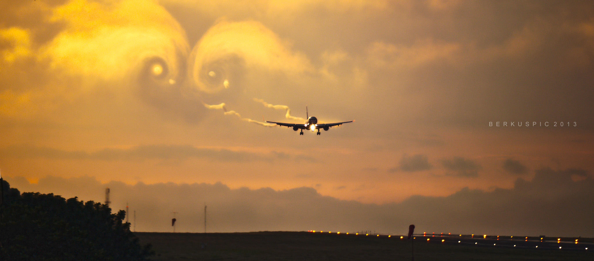
American Airlines Boeing 757-200 on final approach to Juan Santamaria International Airport.
While not the most colorful of images, this picture taken by Bernal Saborio illustrates one of the biggest phenomenons in aviation: wake turbulence.
As an avid fan of aviation and automotives, I was fascinated by the beauty of wake turbulence. In short, wake turbulence is turbulence generated by an aircraft as it passes through the air. It is highly studied due to the dangers it poses to aircraft that might fly into a prior plane’s wake turbulence.
Additionally, it gives stunning visuals; whether intentional (experiments designed by scientists) or natural (a plane flying through a cloud). In this image, the viewer is not drawn immediately to the plane, but to the clouds disturbed by the turbulence the plane left behind. The clouds look like they have formed wings themselves.
Image: AA B752
Source: Bernal Saborio Flickr
7 Comments. Leave new
2nd place, I love the use of the natural environment and lighting to show the wingtip vortices. The runway in the corner with the lights also adds a sense of depth to the photo.
2nd Place. Simply love the image. It makes people wonder why a symmetrical, face-like cloud was left behind as the the plane flew by. Interesting.
First Place: I like the blend of the familiar airplane flying with the often unseen vortex pair in the background. The warm colours as well as the composition really make this an exciting picture.
Third place. I have a special appreciation for the really big, macro-scale fluid visuals. It must have taken a lot of patience and very specific conditions to capture this image. In any case, it is a very cool photo!
Third Place. The lighting of the clouds couldn’t have been better. The image both portrays the cause and effect of the fluid motion both through the physics and the art.
2nd Place. Jeremiah, I love this! The soft lighting contrasting with the dark shadows is striking. It makes me interested to learn more about the fluids behind the photo!
Nice submission Jeremiah. I have to say I quite like the warm colors in this photo. Although an aircraft on landing approach will most certainly have a decent sized wake the thing I am most drawn to in this photo is the effect of the wing induced vortices. In the true aerodynamic sense a wake is a region of low momentum (velocity) fluid behind a solid body passing through air and is produced due to viscosity. The wing tip vortices are regions of intense fluid rotation due to air slipping around the end of the wing from the high pressure on the bottom to the low pressure on the top and is a byproduct of producing lift on a finite wing. In this particular case the counter-rotating vortices are actually coming from the landing flaps and are visible in both the condensed air streams directly behind the wing and in the swirling cloud in the background. These vortices are also a risk to other air traffic and have received attention in studies of aviation safety. For example the next aircraft will have to wait an FAA mandated amount of time before landing to allow the vortices to breakdown due to viscosity.
By studying the full sized image you may also infer something about the post processing. Notice how most of the image looks a little blurry with the exception of the plane (look at the objects on the ground). This is probably because there was not enough ambient light to achieve a fast shutter speed. The airplane on the other hand does not look blurry but it does look a little “grainy”. I suspect the photographer used an effect called “unsharp mask” to make the subject of the photo (the plane) look sharper and save an otherwise cool photo. Graininess in photos can also be an effect of using high ISO to compensate for low light (this is especially true on less expensive consumer cameras). Tools like unsharp mask and awareness of the level of your ISO may be useful when you start taking your own photos.