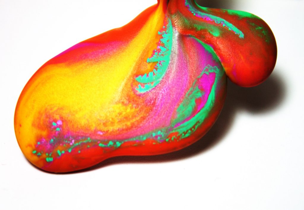
Colored wax flows: interacting, mixing, and changing state from a liquid to a solid
Full report: flow-visualization-get-wet-project-s
By: Mark Noel
Colored wax flows: interacting, mixing, and changing state from a liquid to a solid
Full report: flow-visualization-get-wet-project-s
By: Mark Noel
24 Comments. Leave new
[…] types play a crucial role in how wax color interacts. Coarser hair may require more product, but careful application is necessary to avoid stiffness. […]
The colors are gorgeous, nice editing. A different focus point might have helped with more clarity around the edges of the image. I like how the mixing of the colors was frozen not only by the camera but also by the hardening wax.
This picture is cool, I like the color, particularly the colors. The flow is nicely frozen in time. I like the technique, good contrast, and good shadow with a clear edge on the right and a little softer on the right.
This is a cool flow with lots of great color. How far through the cooling phase was the wax? How quickly was it moving?
It would be cool to get a sense of scale in this image, but the colors and overall photo is crisp. The colors work well together and the background suits the image.
I really like the technique that you used to create this photo. The post processing of the photo really brings out the colors in the photo. Great job!
Nice use of color. Processing the image to make the green wax pop makes for a more interesting image. The wax itself is well lit and the background was well chosen to keep the attention on the subject.
I absolutely love the color choice and the bulbous structure that resulted from the wax pooling together. Picture could be a little clearer on some parts but it’s not too distracting. Really cool picture!
The originality of this photo is really impressive. I had no idea what it was until the description. The color is fantastic. good depth of field on the photo
1. The colors are striking and the speckles and flecks of green lend to the image.
2. The flow and viscous nature of the wax is demonstrated well.
3. The technique is excellent.
Your colors are spectacular! The neon greens in the red base are a great contrast. Good idea to melt crayons together too. It adds a smooth texture that would be hard to get with different materials. I can’t think of any recommendations for your image, great job!
Art: The color contrast between the background and the colors in the melting wax is beautiful.
Flow: The flow is quickly understandable and easily recognized.
Photographic technique: The focus of the wax is great.
Very interesting image, it looks like hot lava! The focus is sharp but loses some clarity in front, which may indicate focus was set too far back or a little blurriness is due to too long of an exposure (depends if the flow was moving quickly as well). Well done!
– I really like this photo.
– The colors are truly spectacular
– I really like how you can keep contrast and have a lot of saturation
The photo is quite interesting to me. I like the use of low viscosity fluids. The photo has very vibrant pictures, but the saturation may be a bit much.
I love the neon-bright color. I love that the shadow really emphasizes the curves and viscosity of the wax. The white background really brightens the image and gives it a happy feel.
Beautifully striking image, the colors are particularly vibrant. The white background does an excellent job at emphasizing the shapes and colors. One thing is that the crop of the image at the top of the photo seems a bit abrupt.
Art: The colors are very cool. Flow: The thickness of the flow is interesting. Photographic Technique: The focus is great and I like the shadow seen underneath the flow.
-Neat texture and nice looking shadows
-Beautiful way to visualize the wax mixing together
-Great looking background with good contrast range
Art: Love the shadowing
Flow: The melting of the plastic which shows the colors
Photographic Technique: Many a little to much saturation
The range of color is spectacular. The image is saturated and gives the image vibrant and neon colors. The mixing of the crayons and the cooling effect of the wax helped create an aesthetically pleasing piece of art.
Awesome picture, almost looks like it is sparkling. Looks really awesome. Depth of field is really small I think which gives it a cool effect. The stuff a little farther back is in focus and the close stuff is a bit fuzzy.
Very nice photo. Super sharp focus, lots of detail, and great colors. The green almost looks neon due to the saturation, almost looks like a glow in the dark effect. Clean white background is satisfying as well. I think a second light source to get rid of that shadow might help, but I really like the way it looks.
– Great interaction of colors it’s psychedelic!
– Interesting use on the cooling effects with the heat gun and acrylic ramp.
– The bulbous effect provides a interesting texture/feel to it.