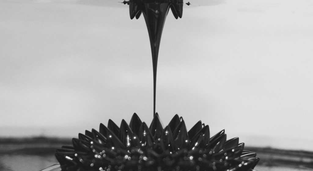
Very cool image. Interesting effect of the ferrofluid being drawn to two locations by competing magnets. Looks like the focal plane was right where it needed to be. If this were purely an art project you could have moved the center spike to get perfect symmetry but in the context of this class I think you made the right choice to leave it.
This is a very cool dynamic twist on the classic ferrofluid spike images. I really like the new route you’ve taken. There is a balance to this image as well, but it a little offset from you teammates. I told them that it feels similar to the “Creation of Adam” painting by Michelangelo on the ceiling of the Sistine Chapel, but this one’s vertical orientation is a little less the case. Either way I like it, nicely done!
Nice composition; I love the symmetry. I would consider increasing the contrast a little bit. I also like how the bright reflections in the ferrofluid are kind of blurry. A multiple exposure effect might have been cool to see how the fluid built up on the other side
I especially appreciate how you captured the thin flow that is moving from bottom to top of the image which is contrary to what we are accustomed to seeing in gravitational droplets. You have the same contrast challenge with the background that I did. That black and white was a good idea to isolate the flow being illustrated.
Very interesting, the vertical, gravity defying spire really draws the viewers attention. A little more work with the lighting would have really made the instability of the fluid surface more visually appealing.
I like how symmetrical this photo is. The light reflections are blurry but that gives this a cool effect. Photo looks a little unevenly cropped which messes with the symmetry a bit.
I like how clean this image is. The black and white make the flow clearly visible as the focus of the image. The focus and detail is good, a bit more contrast could be used though.
The black and white adds nicely to the image. The focus on the center column of ferrofluid is superb. Blurriness leading off to the sides helps to draw the viewer into the center, great job.
Nicely focused image, the blurring in the background adds to overall appeal of the photo. The contrast between the ferrofluid and the ink is nice. Clean background gives nice effect to image.
Very cool and symmetrical photo. Again, the sharp focus on the extremely small filament is great! I also like the almost opposite silhouette effect. caused by the high ocntrast.
15 Comments. Leave new
Very cool image. Interesting effect of the ferrofluid being drawn to two locations by competing magnets. Looks like the focal plane was right where it needed to be. If this were purely an art project you could have moved the center spike to get perfect symmetry but in the context of this class I think you made the right choice to leave it.
This is a very cool dynamic twist on the classic ferrofluid spike images. I really like the new route you’ve taken. There is a balance to this image as well, but it a little offset from you teammates. I told them that it feels similar to the “Creation of Adam” painting by Michelangelo on the ceiling of the Sistine Chapel, but this one’s vertical orientation is a little less the case. Either way I like it, nicely done!
Nice composition; I love the symmetry. I would consider increasing the contrast a little bit. I also like how the bright reflections in the ferrofluid are kind of blurry. A multiple exposure effect might have been cool to see how the fluid built up on the other side
I especially appreciate how you captured the thin flow that is moving from bottom to top of the image which is contrary to what we are accustomed to seeing in gravitational droplets. You have the same contrast challenge with the background that I did. That black and white was a good idea to isolate the flow being illustrated.
Very interesting, the vertical, gravity defying spire really draws the viewers attention. A little more work with the lighting would have really made the instability of the fluid surface more visually appealing.
I like how symmetrical this photo is. The light reflections are blurry but that gives this a cool effect. Photo looks a little unevenly cropped which messes with the symmetry a bit.
Great display of fluid flow. I love how the image was taken when the ferrofluid was almost pinched off. Definitely an aesthetically pleasing image.
I think the image in only black and white is very interesting. It does a good job on bringing out the flow from the bottom to the top. Well done.
I like how clean this image is. The black and white make the flow clearly visible as the focus of the image. The focus and detail is good, a bit more contrast could be used though.
The black and white adds nicely to the image. The focus on the center column of ferrofluid is superb. Blurriness leading off to the sides helps to draw the viewer into the center, great job.
I like the black and white. Good contrast. The long beam in the center is great. More depth of field would be nice
Nicely focused image, the blurring in the background adds to overall appeal of the photo. The contrast between the ferrofluid and the ink is nice. Clean background gives nice effect to image.
Sorry I meant to put this on your teammates image.
I like the use of black and white in the image. Nice sharp focus and detail. Nice symmetry. Draws my attention to the center.
Very cool and symmetrical photo. Again, the sharp focus on the extremely small filament is great! I also like the almost opposite silhouette effect. caused by the high ocntrast.