
Matt Beckemeier – Team Third
Categories
Flow Vis Guidebook
- Introduction to the Guidebook
- Overview 1: Phenomena. Why Does It Look Like That?
- Overview 2: Visualization Techniques
- Overview 3: Lighting
- Overview 4 - Photography A: Composition and Studio Workflow
- Overview 4 - Photography B: Cameras
- Overview 4 - Photography C: Lenses - Focal Length
- Overview 4 - Photography C: Lenses - Aperture and DOF
- Overview 4: Photography D: Exposure
- Overview 4 - Photography E - Resolution
- Overview 5 - Post-Processing
- Clouds 1: Names
- Clouds 2: Why Are There Clouds? Lift Mechanism 1: Instability
- Clouds 3: Skew - T and Instability
- Clouds 4: Clouds in Unstable Atmosphere
- Clouds 5: Lift Mechanism 2 - Orographics
- Clouds 6: Lift Mechanism 3 - Weather Systems
- Boundary Techniques - Introduction
- Dye Techniques 1 - Do Not Disturb
- Dye Techniques 2 - High Visibility
- Dye Techniques 3 - Light Emitting Fluids
- Refractive Index Techniques 1: Liquid Surfaces
- Refractive Index Techniques 2: Shadowgraphy and Schlieren
- Particles 1- Physics: Flow and Light
- Particles 2: Aerosols
- Particles 3: In Water
- Particles 4 -Dilute Particle Techniques
- Art and Science
- TOC and Zotpress test
- Photons, Wavelength and Color
13 Comments. Leave new
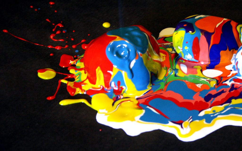
I really like the impact that is seen in this photo. Also the choice to shoot the impact from above is really interesting. The colors are great too!
Brilliant colors, and the focus of this image is excellent. There is a strange flare in the top center of the image you might want to try and remove in post processing.
Great bright colors contrast well with each other and the dark background. Very modern, abstract feel to the image.
I really like the dark background compared to the bright colored painted rocks in the foreground. Very nice lighting and focus as well.
The rocks are certainly a neat surface to cover in paint. it is a touch out of focus, and there is a bit of blur around the area of paint addition. I like the inclusion of the red paint splatter. Did you consider crushing the background to pure black?
A deeper black background may add to the contrast between all the colors of the paints interacting. The graininess may be due to ISO being too high. The shutter may be too long or the focus is set a little to far forward and the result is some blurriness is in the image. Using the rocks was a very interesting choice, as it helps to showcase the 3D effects of the paints mixing.
The color used in this image are very vibrant and look great. The crater created by the paint flow is an interesting detail that I really like.
The impact crater is a very nice touch; and the contrast between the dark background and the colored paint is nice and sharp.
Very colorful photo. I like the crater displayed where the paint is hitting the rock. I also wish the focus was slightly more sharp. You can see the blur around the edges of the paint in the front.
The colors are great! I love the contrast. The red splatter is nice but the focus could have been better
The eye immediately goes towards where the paint hit the rock. The splash of the paint is very interesting.
1. Nicely done artistic image. The composition is interesting, and the colors are vibrant and well shown.
2. The physics are well shown.
3. The photographic technique is good.
I like how you can see the impact crater on the left rock. It is cool to see how all of the paints mix together. This work reminds me of Gaudi in Barcelona.