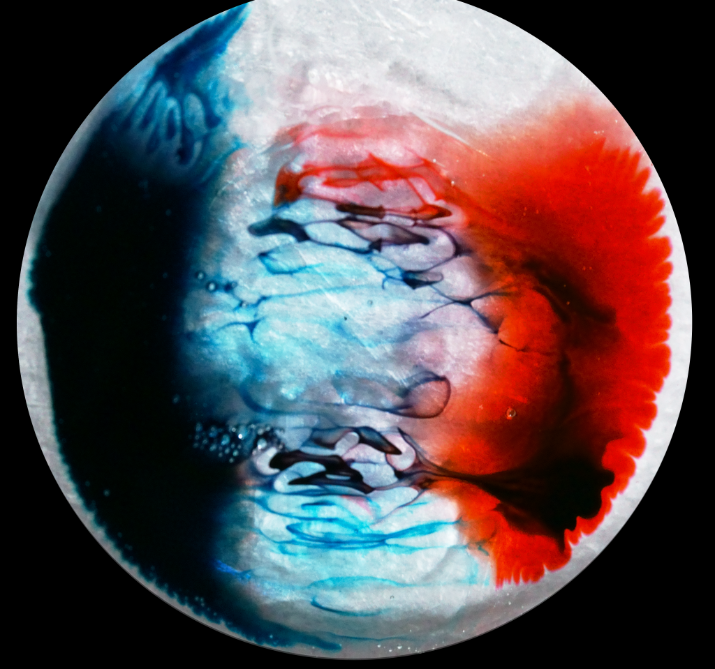
This has a very patriotic appeal to it, with the red, white, and blue. It’s amazing to see how the colors interact. It seems that there is a face in the center with a red and blue background.
This is so cool! Reminded me of Spider-Man and The Grateful Dead logos. The choice of contrasting the edge of the circle with a black backdrop really makes the subject of the image pop.
I’m really curious as to how you imaged this. It looks really nice! I wonder what caused the bubbles to form. Is there a way to control this for a desire effect?
I love the use of the petri dish. It makes it look like a planet in space. The flow is really cool an reminds me of a storm on Jupiter or something.
Adding yellow would be cool in the future.
I think the aesthetic could be improved with less blue food coloring. The around on the left is too heavy and makes the flow feel unbalanced. Photographic technique is great.
I really like the dark contrast in the middle of the dish with the thin streamers of dye. I like how dark the red dye is in the center. The cropping could be a bit more geometric to include the full circle of the dish.
This image kinda looks the moon at first glance. Did you mean for there to be the strands in the middle of the image, or was that a result of what you did?
It is very aesthetically pleasing the way that the blue and the red conttrast each other and just barely meet each other in the middle. Did you try adding any external force?
Art: The image is amazing. I like the ‘stringiness’ between the red and blue dyes.
Flow: The flow is clear and is well defined.
Technique: Great contrast, exposure and framing.
This image has a nice feel to it. The white makes the colors really pop, but the black seems like it is taking away from some of the vibrant-ness of the colors. Was this intentional? Overall I really like it.
The three distinct color regions with a mixture of all three in the middle is a cool image. The flow is interesting and looks cool. The picture looked sharp and clean.
I like how the subject is isolated, it makes it look like a planet out in complete darkness. The contrast between the red and the blue is very nice with the soft white barrier in the middle. I would like to know how you shot this photo and how you took out the background, was it post processing or did you physically put up a background? Looks good
great use of corn syrup, its a great non-Newtonian fluid. The flow came out great. Also, good photography, I’d suggest changing the exposure on the dark edges.
This is a very interesting picture with the mix of the red, white, and blue colors (very patriotic). The dark and light colors mix very well. Overall really cool picture.
I can see the planet effect you’re going for in this image and it looks like paintings on the surface of the moon or something similar. The exposure works in this image’s favor because the blue dye creates a dark and interesting center
This is really cool, it kind of looks like a planet or something. The dark blue lines are really nice. The really dark part on the left loses some detail, is there anyway you can regain some detail by lowering the contrast in that section?
Very cool experiment and I like the result. I think maybe the focus was off a tiny bit in the top since it is very in focus on the bottom, unless that is an effect of the fluid.
Art:
Real cool! It looks like it’s from a comic book :) It’s a great composition—I like how you framed it with the background.
Flow:
Clearly illustrates surface tension driven flow
Photographic Technique:
It’s time and space resolved, good job. Everything looks focused.
I really like this image. The red white and blue coloring in your image really reminds me of the American flag. The flow of happening in the center is very interesting.
This flow reminds my of the intricacy of a planet’s atmosphere. The color choice is solid and the various aspects of the flow really pull the piece together.
46 Comments. Leave new
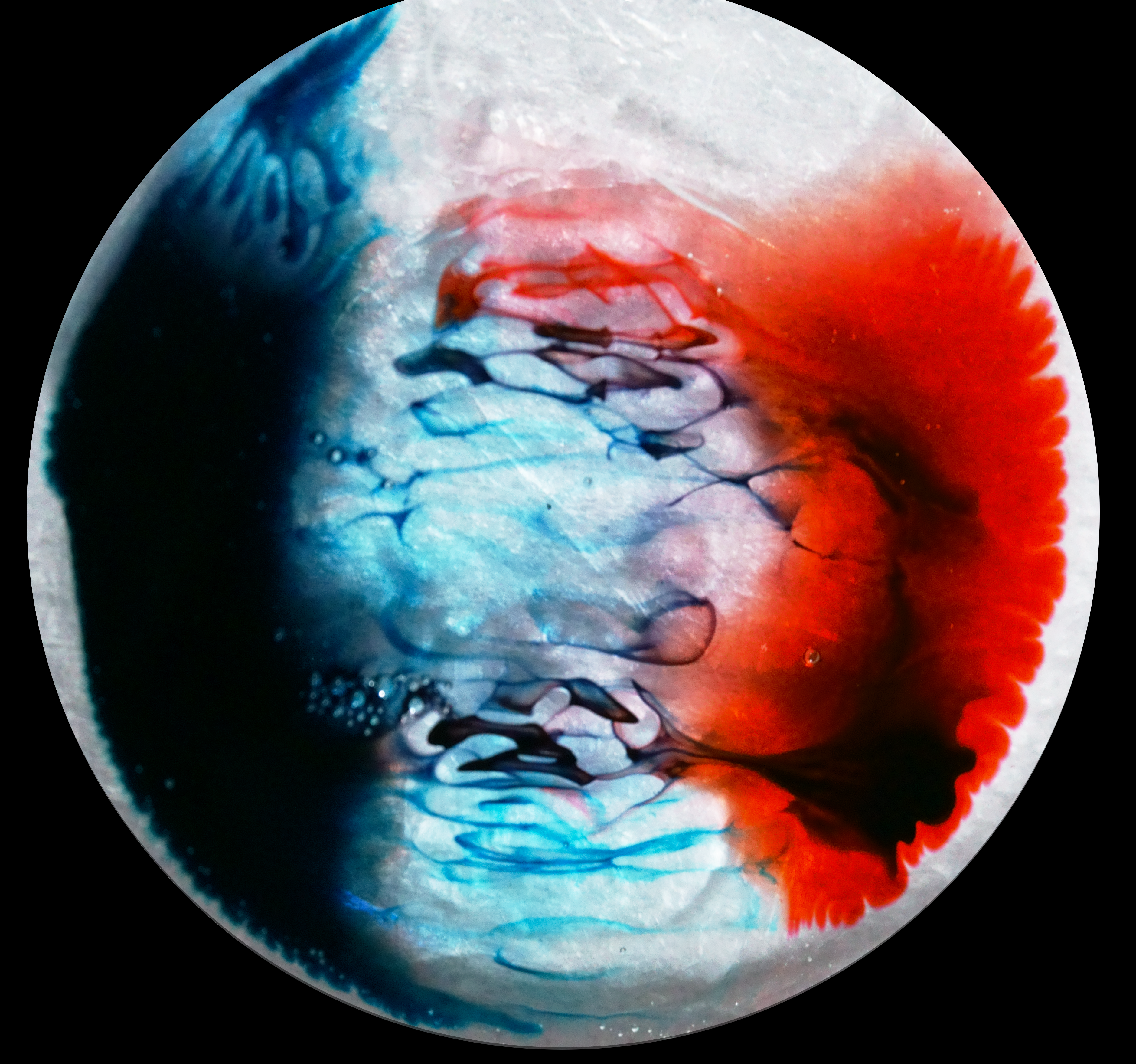
This has a very patriotic appeal to it, with the red, white, and blue. It’s amazing to see how the colors interact. It seems that there is a face in the center with a red and blue background.
I like this colors on this image looks like a cosmic planet. nice framing as well
This is so cool! Reminded me of Spider-Man and The Grateful Dead logos. The choice of contrasting the edge of the circle with a black backdrop really makes the subject of the image pop.
Outstanding use of colors and framing, the coiling effect draws the eye very nicely
I’m really curious as to how you imaged this. It looks really nice! I wonder what caused the bubbles to form. Is there a way to control this for a desire effect?
It is very cool image with two different colors and dish soap.
Beautiful colors, beautiful demonstration of flow, and beautiful photographic technique.
The colors look great and the coiling effect is shown well. Great image.
Love the red and blue mixing. Pretty culturally relevant too. Beautiful
A great balance in color and contrast. Maybe just adjust the brightness so that the blue is more apparent.
I love the use of the petri dish. It makes it look like a planet in space. The flow is really cool an reminds me of a storm on Jupiter or something.
Adding yellow would be cool in the future.
I think the aesthetic could be improved with less blue food coloring. The around on the left is too heavy and makes the flow feel unbalanced. Photographic technique is great.
I find it beautiful seeing the separation with the two colors. the flow is controlled nicely and the focus is great.
I really like the dark contrast in the middle of the dish with the thin streamers of dye. I like how dark the red dye is in the center. The cropping could be a bit more geometric to include the full circle of the dish.
Great color choice. I like how there is a vivid distinction between the three colors and the mixing from the flow between them.
This image kinda looks the moon at first glance. Did you mean for there to be the strands in the middle of the image, or was that a result of what you did?
The circular dish is great and the colors diffusing in the center is pretty cool looking!
Very beautiful picture, good coloring. The flow is understandable. Focus is good for this picture. Good idea.
Love the interaction in the corn syrup stripe – very visually interesting.
I love the way the colors seem to be pulling on each other. The set up behind this experiment was creative and simple.
I immediately thought of Grateful Dead. Very cool photo. The colors are great.
It is very aesthetically pleasing the way that the blue and the red conttrast each other and just barely meet each other in the middle. Did you try adding any external force?
Art: The image is amazing. I like the ‘stringiness’ between the red and blue dyes.
Flow: The flow is clear and is well defined.
Technique: Great contrast, exposure and framing.
This image has a nice feel to it. The white makes the colors really pop, but the black seems like it is taking away from some of the vibrant-ness of the colors. Was this intentional? Overall I really like it.
The coiling effect is quite prominent here due to the food coloring and I really like how you decided to focus on the center of the image.
Beautiful image!! I like the idea of using corn syrup in the middle. Nice job in using lighting.
Excellent balance in the framing and colors of the image, image is just a tiny bit grainy, implies a division or coexistence.
The way the colors separate is fun and you managed to keep one color and each side
The three distinct color regions with a mixture of all three in the middle is a cool image. The flow is interesting and looks cool. The picture looked sharp and clean.
Very impressive image, I like the color you choose, they make really good contrast. It is interesting to see how two colors interact each other.
I like how the subject is isolated, it makes it look like a planet out in complete darkness. The contrast between the red and the blue is very nice with the soft white barrier in the middle. I would like to know how you shot this photo and how you took out the background, was it post processing or did you physically put up a background? Looks good
The colors you picked are very interesting! It was really helpful to see this photo on the big screen! The coiling came out very well.
great use of corn syrup, its a great non-Newtonian fluid. The flow came out great. Also, good photography, I’d suggest changing the exposure on the dark edges.
The thin coils of food coloring is interesting. I like the contrast in the colors, and the image is helped by the black background.
Love the red, white, and blue, colors (patriotic). Overall the saturation is pleasing and the flow is marangoni-driven and beautiful to look at.
This is a very interesting picture with the mix of the red, white, and blue colors (very patriotic). The dark and light colors mix very well. Overall really cool picture.
I can see the planet effect you’re going for in this image and it looks like paintings on the surface of the moon or something similar. The exposure works in this image’s favor because the blue dye creates a dark and interesting center
Really awesome photo with good contrast and blue and red color. The texture looks amazing. Such a great looking visualization of flow
This almost seems futuristic as if two sides are colliding. I feel like these colors are often seen in movies representing something medical.
Very cool photo I like how there is a lot of contrast between the red and blue side it makes the image look “balanced” in a way.
This is really cool, it kind of looks like a planet or something. The dark blue lines are really nice. The really dark part on the left loses some detail, is there anyway you can regain some detail by lowering the contrast in that section?
I really like the opposing blue and red sides of the image!
Very cool experiment and I like the result. I think maybe the focus was off a tiny bit in the top since it is very in focus on the bottom, unless that is an effect of the fluid.
Art:
Real cool! It looks like it’s from a comic book :) It’s a great composition—I like how you framed it with the background.
Flow:
Clearly illustrates surface tension driven flow
Photographic Technique:
It’s time and space resolved, good job. Everything looks focused.
I really like this image. The red white and blue coloring in your image really reminds me of the American flag. The flow of happening in the center is very interesting.
This flow reminds my of the intricacy of a planet’s atmosphere. The color choice is solid and the various aspects of the flow really pull the piece together.