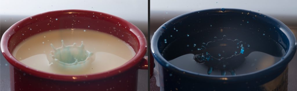
Side-by-side of the impact in milk and water of a droplet of water dyed blue
Team First – Jake Lanier
Search
Categories
Flow Vis Guidebook
- Introduction to the Guidebook
- Overview 1: Phenomena. Why Does It Look Like That?
- Overview 2: Visualization Techniques
- Overview 3: Lighting
- Overview 4 - Photography A: Composition and Studio Workflow
- Overview 4 - Photography B: Cameras
- Overview 4 - Photography C: Lenses - Focal Length
- Overview 4 - Photography C: Lenses - Aperture and DOF
- Overview 4: Photography D: Exposure
- Overview 4 - Photography E - Resolution
- Overview 5 - Post-Processing
- Clouds 1: Names
- Clouds 2: Why Are There Clouds? Lift Mechanism 1: Instability
- Clouds 3: Skew - T and Instability
- Clouds 4: Clouds in Unstable Atmosphere
- Clouds 5: Lift Mechanism 2 - Orographics
- Clouds 6: Lift Mechanism 3 - Weather Systems
- Boundary Techniques - Introduction
- Dye Techniques 1 - Do Not Disturb
- Dye Techniques 2 - High Visibility
- Dye Techniques 3 - Light Emitting Fluids
- Refractive Index Techniques 1: Liquid Surfaces
- Refractive Index Techniques 2: Shadowgraphy and Schlieren
- Particles 1- Physics: Flow and Light
- Particles 2: Aerosols
- Particles 3: In Water
- Particles 4 -Dilute Particle Techniques
- Art and Science
- TOC and Zotpress test
- Photons, Wavelength and Color
31 Comments. Leave new
I love that you put two images side by side! great contrast! also they are cropped perfectly Nice job
Great capture. Perfect moment captured with nice focus and technique. good photo.
The juxtaposition of of these images is very interesting. Perhaps you could use a different color for the milk on the left to invoke a different emotion.
Neat concept. Love the contrast in colors. Nice job getting the milk shot on first few tries. Would love to see larger images.
Great comparison of the droplets. I like how the colors are contrasted with one another.
Great contrast and composition, the side by side Andy Warhol vibe is really cool.
Nice comparison. It might be cool to see both of the drops in the same color of container.
I like the comparison of red and blue. Is the one on the left water in a blue pot? You can see the blue dye spreading in veins in the virgin milk, and that is pretty cool.
The side by side is composed nicely. I think a time series of similar photographs would add value.
Great contrast and positioning between the images. I think a different colored mug would highlight the right image a lot better, since it is a little hard to see.
It is interesting to see how the blue is so different in both of these images, even though they are so similar.
I like the side by side comparison of milk and water. The image is very clear and I like the hot and cold contrast. My one critique is that the color of the water is very similar to the color of the cup which just makes it looks like its regular water, or maybe make it more clear the only the droplet is blue. Overall I really like it!
The framing does a really good job of comparing the images. Good attention to detail. The only comment I can think of is the background under the mug. I think that could be a bit more cleared off.
Interesting experiment and I like how you put the images next to each other so the audience can see the difference between the two experiments. Good lighting and photo editing.
Excellent display of cavitation and the crowning effect. The impact looks so similar at both images that the colors seem to be the only thing that differs (which is really cool).
I like the comparison between the two image, it is interesting to see how the two fluids behave slightly differently under the same setup!
It is interesting finding the difference between the water and milk. The red and blue cups is a nice aesthetic touch in the comparison.
I love the juxtaposition of the two impacts in the different fluids that allows the differences in properties to be seen, as well as the different colors used in each image. Good focus and exposure on both images.
I like the offset of color and contrast of the droplets themselves. I really like this image! The blue is very subtle in the milk, a brighter color would allow us to see the coronet more clearly. However, if you were going for subtlety, then I wouldn’t change a thing!
I like the image overall especially with the splash particles flying up. I feel like the dark blue image is really hard to see the flow because it is blue on blue. Maybe a different color there would have be better.
I like the two images side by side, they are positioned well and contrast each other. I like how you have a red and a blue mug to hold the different liquids. It’s cool to see something so similar in technique but with different color liquids and containers. This photo is really unique, good job.
I wonder what the comparison would feel like if you stacked the images on top of each other instead of side by side. Excellent focus.
I like how you included two images in this and the contrasting colors accent each other well. You’ve captured the fluid flow of the two water droplet crowns perfectly.
Nice splashing, shows good fluid flow. Artistically it could add some value, maybe more color. Overall nice image and photography.
These images are beautifully captured. It might be more effective to have both cups be the same color, but it’s still effective the way it is.
I really like the color contrast between the different sides of the image. The contrast of water versus milk flow is a cool idea. I like the focus and the diffuse background color.
The bowls are slightly distracting, I think this image could have benefited from some more cropping. The effect is nicely captured. Good photo.
The blue food die in the blue cup makes the flow a bit hard to see, maybe consider using a lighter color cup? Otherwise, the focus and time resolution are really good and really highlights the flow phenomenon.
I like these, especially the left one… I might have cropped them more to remove more of the background or cup.
Really nice. There’s a little glare in the right image. The contrast between the milk and water dynamics are nice. Do the crowns have different numbers of ridges?
This is a cool idea. I’d like to see a view even with the surface of the liquids, to see how the different liquids splash.