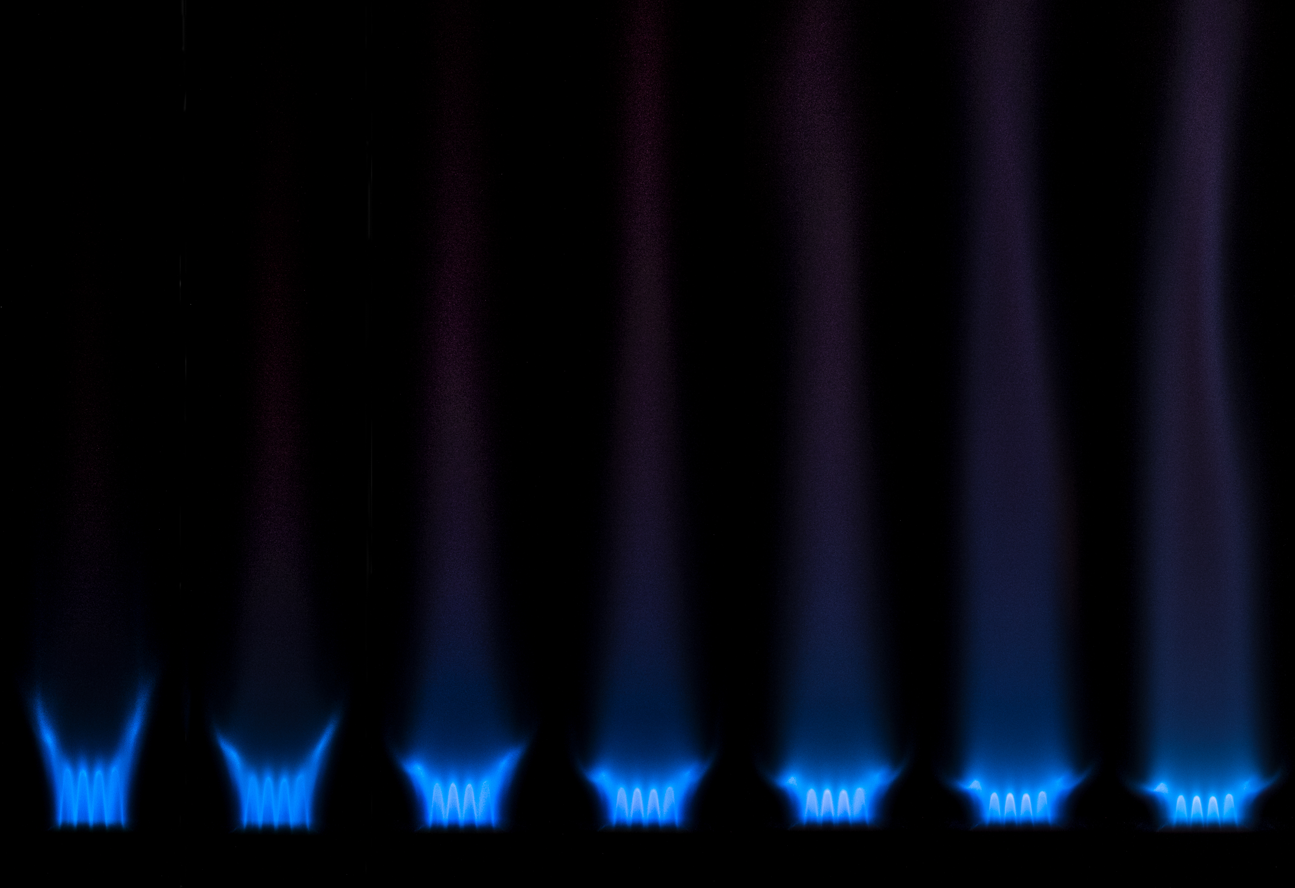
This composite shows a methane/air flame at varying equivalence ratios (phi).
Report Link: https://www.flowvis.org/wp-content/uploads/2018/04/Ribburn-Burner-Methane-Air-Flame-Photographed-at-Varying-Equivalence-Ratios.pdf
This composite shows a methane/air flame at varying equivalence ratios (phi).
Report Link: https://www.flowvis.org/wp-content/uploads/2018/04/Ribburn-Burner-Methane-Air-Flame-Photographed-at-Varying-Equivalence-Ratios.pdf
29 Comments. Leave new
Nice juxtaposition and color composition
Really interesting dynamics near the burner, I really like the presentation and captions. Very nice, clean, understandable phenomenon.
This is beautiful. I think this could definitely benefit someone in the scientific community.
Great idea and cool flame. I like the scientific nature of this photo. This layout is helpful too.
I like how you made a progression of images, this is really scientific. It shows the flow well and is beautiful at the same time. I can appreciate a good combination of beauty and science
Cool images. I really like the layout and cleanliness of each image.
Excellent image, labeling the equivalency ratios really adds to the scientific value and the physics are clearly visible. Showing the differences between the flames is a great idea.
A peculiar flow. Nice work!
Very unique photo set. I like the idea behind the photo and it is also very interesting how the different flame form with different ratios.
Very interesting image, good job
Great job relating research to the content of this class. The image is laid out in a very understandable fashion. Cool phenomenon.
I like the progression of flames, especially the dull red color in the far right image. Nicely done!
This is a really well thought out experiment. The flames lined up and labeled makes it much easier to understanding what is going on.
The flame is beautiful on its own and I appreciate your choice to focus on its properties in this composite. Thank you for labeling the equivalence ratios.
I like the multi-panel idea
Unique and interesting image. I like that you give the ratios. Overall very nice.
Nice progression. You should make a gif with these.
I like comparing pictures and how different phi value affect on your image.
cool experiment and good job focusing the flame in the image. The consistency in the framing across the various phi values is very well organized.
I like how you laid out these images side by side. You are able to directly compare the changes in flame shape, really unique.
Cool images. The comparison of how these flames are changing is a really interesting idea. I like the framing of the flames, and the contrast looks good.
Good focus and I like the progression of the photos. I think you could omit the caption with phi on the bottom of each image, that is something that can go into the report. I also feel like the white background is a little overpowering. Maybe use a light grey or something that blends a little more with the colors in the image?
I like how you labeled the equivalency ratios along with their relative flame lengths. Overall, informative and interesting.
I really like the progression that is visible with the changing phi value. Really nice work!
I like the way you layered these photos! it also really helped that they were labeled
The flow is really pretty and I really like the flame color. The images are strung together really well.
I really like how the flame grows as you move from left to right in the image and then color is really great.
Neat visualization but I wish I could see a larger version because it seems like an interesting phenomenon. The scientific aspect is good.
Beautiful flame and nicely labeled equivalency ratios.