Team 3rd Michael Guenther
Categories
Flow Vis Guidebook
- Introduction to the Guidebook
- Overview 1: Phenomena. Why Does It Look Like That?
- Overview 2: Visualization Techniques
- Overview 3: Lighting
- Overview 4 - Photography A: Composition and Studio Workflow
- Overview 4 - Photography B: Cameras
- Overview 4 - Photography C: Lenses - Focal Length
- Overview 4 - Photography C: Lenses - Aperture and DOF
- Overview 4: Photography D: Exposure
- Overview 4 - Photography E - Resolution
- Overview 5 - Post-Processing
- Clouds 1: Names
- Clouds 2: Why Are There Clouds? Lift Mechanism 1: Instability
- Clouds 3: Skew - T and Instability
- Clouds 4: Clouds in Unstable Atmosphere
- Clouds 5: Lift Mechanism 2 - Orographics
- Clouds 6: Lift Mechanism 3 - Weather Systems
- Boundary Techniques - Introduction
- Dye Techniques 1 - Do Not Disturb
- Dye Techniques 2 - High Visibility
- Dye Techniques 3 - Light Emitting Fluids
- Refractive Index Techniques 1: Liquid Surfaces
- Refractive Index Techniques 2: Shadowgraphy and Schlieren
- Particles 1- Physics: Flow and Light
- Particles 2: Aerosols
- Particles 3: In Water
- Particles 4 -Dilute Particle Techniques
- Art and Science
- TOC and Zotpress test
- Photons, Wavelength and Color
18 Comments. Leave new
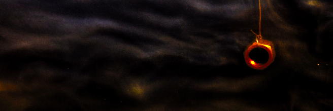
Focus and lighting make the image hard to see but I think this picture would be good if you posted a more in focused image.
Neat Nut! I couldn’t tell what it is. It looks quite low-res and grainy, but I only say that because my image is too. You have some really neat hues in this image. The brighter you make it, the grainier it’ll get, but it is something to play with. Good job.
I like the subtle smokey effect that the fluid gives. I like the bright red of the nut, but the contrast of the flow could be greater.
I wish the flow was more resolved.
Neat image. I like the colors. Quality is a little grainy here and could be improved. Because of this the flow isn’t that visible but I like the framing and colors
The turbulent is an interesting effect. The image is extremely grainy and low resolution, both the .tif and the website image.
Your image is balanced well and has some flow lines that draw the eye towards the right.
Interesting image, the color contrast between the nut and the background is nice, but the details of the flow are a little difficult to see and the image is low resolution.
Nice contrast between the warm color of the nut & the cool color of the pearlescent.
Cool image, nice artistic value. The colors can be enchanced and the lighting can be increased. Also, it looks a bit griany, which might be a camera effect.
Very interesting experiment. The colors in this image are very nice. Overall good image.
It is an interesting image, I like the contrast between the nut and the background. Overall it is fairly dark, but I think that may have been the design intent.
Looks like the one ring of power.
I really like the colors, composition, and well executed flow.
Cool colors in the image. I feel like the flow is lost in the really dark colors. Maybe lighten a bit and increase contrast to bring out the flow? The image is pretty grainy, I wonder if there was some information loss due to file compression?
I like the contrast between the nut and background. Flow vis post quality is a little blurry though, re-upload?
It’d be interesting to see how the flow changes if you adjust the orientation of the nut.
Bolt looks like it is on fire. Great flow