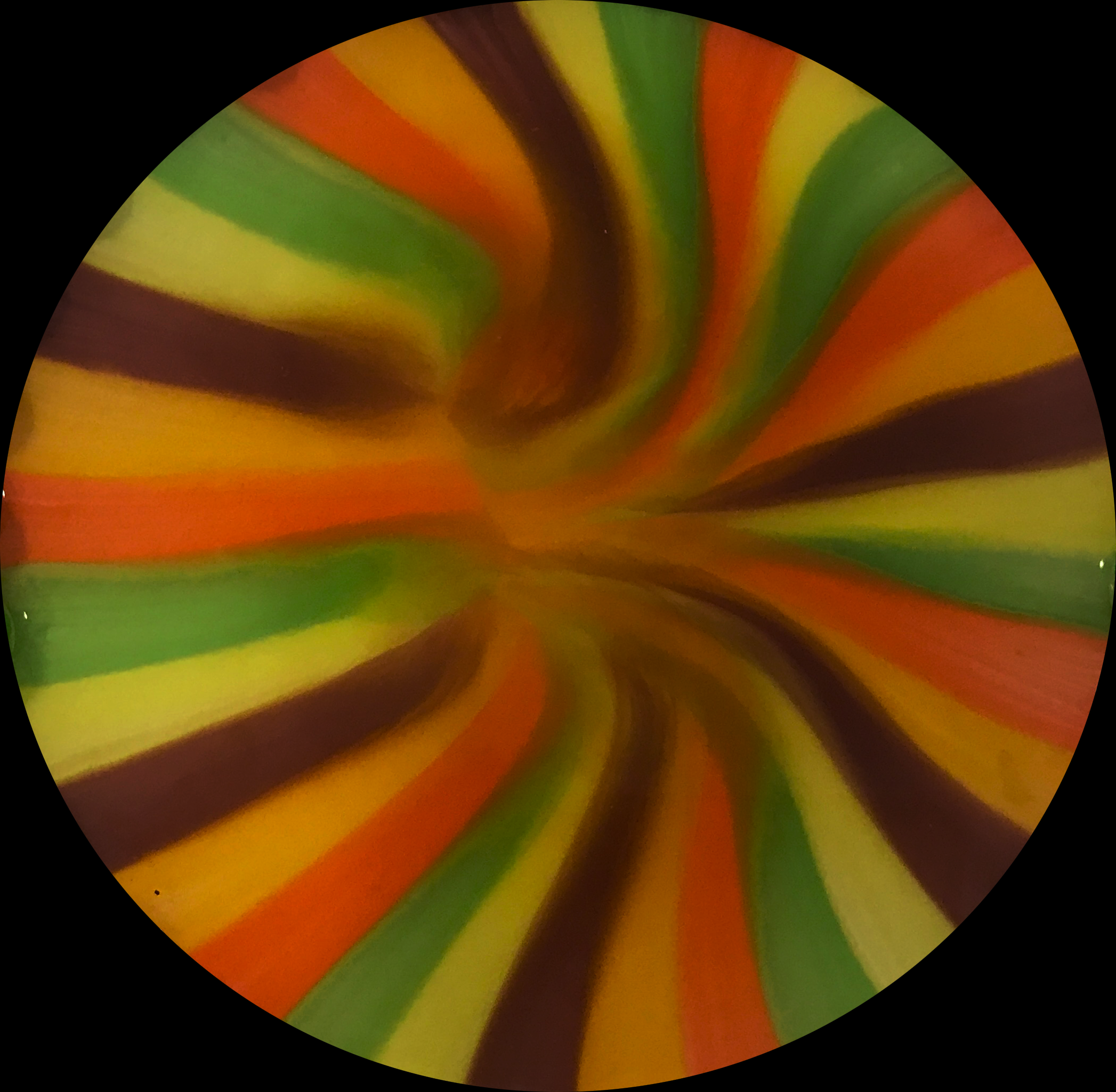
Great image, the colors are fantastic and cropping it into a circle was an excellent choice. Upping the contrast a bit would make the colors more vibrant.
I really like the direction of the colored flows and each of the stripes are differentiated well. The stripes of the skittles seem to bend in the direction towards the center providing a sense of depth.
I like the flow in this image. The colors and path make it almost look like a wormhole. The transparent background is a bit weird, but on the website it looks fine. I wonder what would happen if the saturation/vibrancy was bumped up a bit?
Cool image, it looks like the colors are falling into a hole. I would suggest brightening the image and/or upping the saturation to bring out more bright colors.
14 Comments. Leave new
I really like the colors in this image. It reminds me of a piece of candy.
Really awesome photo! I love the pattern that this created.
Nice picture, it looks three dimensional in a way, the black outline is a little off putting
I really like the flow you captured. The inward spiral is cool to see. I wish the colors were a little brighter.
Very nice vortex effect. This is subtly beautiful.
This looks super cool, great cropping and lighting!
Great image, the colors are fantastic and cropping it into a circle was an excellent choice. Upping the contrast a bit would make the colors more vibrant.
I really like the direction of the colored flows and each of the stripes are differentiated well. The stripes of the skittles seem to bend in the direction towards the center providing a sense of depth.
I like the image, the composition is really cool. The colors are all about the same thickness, and converging in the center was a good focal point.
Cool image, the colors are really nice. I think it can use some post processing to bring out the colors, but overall nice effect.
I like the flow in this image. The colors and path make it almost look like a wormhole. The transparent background is a bit weird, but on the website it looks fine. I wonder what would happen if the saturation/vibrancy was bumped up a bit?
Cool image, it looks like the colors are falling into a hole. I would suggest brightening the image and/or upping the saturation to bring out more bright colors.
This is a nice way to visualize the curvature of the plate and surface tension effects.
Really cool image! Looks like you’re looking through a kaleidoscope :)