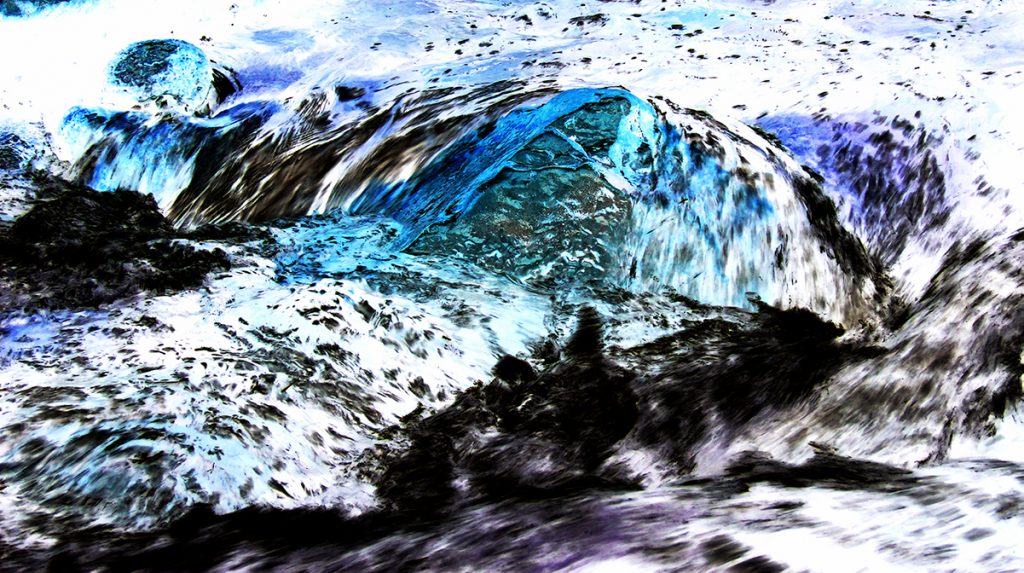

This picture is of an eddy in Boulder Creek, where the turbulent water flows to the sides of the rock. Directly downstream of the rock is a calmer area.
Link to my Get Wet Report: GetWetReport
This picture is of an eddy in Boulder Creek, where the turbulent water flows to the sides of the rock. Directly downstream of the rock is a calmer area.
Link to my Get Wet Report: GetWetReport
28 Comments. Leave new
I like how you decided to invert the colors in this image, i think it really helps bring out where the flow is turbulent vs laminar. I think the picture is great.
I like your picture. It captured all the great things about Boulder. Great work on editing it which made a very good changes.
Well done! This reminds me of a film negative. How was the lighting the day you shot? The still and moving parts of the image are still very apparent because of the motion blur, but with your color inversion, the entire scene takes on an abstract, surreal quality. My favorite part is the teal-colored flow in center of the image; it looks like air bubbles trapped inside thick glass.
Wonderful colors from the inversion effect. It reminds me of mountains and snow. Its cool to see how inversion can drastically change the human eye perception of the photo. Could you add some sharpness for more distinction between colors? Great photo
I really like the flow over the rock as it goes diagonally across. Good framing and i enjoy the color inversion. There is a lot of white in the image so maybe colorizing it or lowering the temp might give it a different look that’s easier on the eyes.
Stunning photo. Looks almost like a mountain range. The contrast with heavy blacks and bright whites give structure to this photo.
The abstraction of the images is very interesting. Knowing that the image has different layers of turbulence or scales depends the image.
The colors that show up in this photo give it a super artistic feel and I do like the way the editing brought out the contrast between flows. I would maybe tone down the white balance a little bit because at first glance it is hard to tell what is going on.
The image is interesting in its abstraction. it may need a little less contrast. what inspired you to take the photo?
The color of image is pretty cool. It seems like a wash painting. The extra-exposure makes the unique color
This also is a cool picture. I like it because it’s not immediately clear what it is, but once you have a basic understanding, you start recognizing more and more features of the creek. It’s very artsy. My only complaint would be that it’s a little bright, and kind of hard to look at for long periods of time.
The contrast highlights it very well and I love seeing the various different flow sections and the lines created.
Good use of color inversion to help understand the flow more. I like the colors of the inversion and the large contrast of the image.
This is an awesome photo. Great job making the turbulent flow of a river into such a bright image. I like the visualization of the different flows in this image, however, the editing could make better use of the color gradients in the photo as there are many areas of full black and white.
I like that the sharp contrast shows the flow more clearly that the original probably did. The inversion give the image a more scientific feeling than a more traditional picture of a stream would. The textures are very interesting. I wonder if you could have less white in the background.
The color inversion helps to draw the eye to different areas than the natural color would. I like the colors and contrast as well.
The color and contrast of the image looks great. The flow of liquid captured pretty well. The difference in color between faster flow and slower flow is great.
This is a really unique photo with the inversion. It really shows the flow in a different way. If it was less edited, it would be more difficult to really focus on the flow of the water itself which I think is great.
The inversion does highlight the higher flows really well, that’s really cool. I would have never thought to do that. You can really see the eddy in the center which a lot of kayakers like to hang out in which lets them chill in the middle of a rapid, yet not really move anywhere. Nice!
Great image processing! The flow between the rocks is interesting to follow. Maybe reduce the amount of white in the image it can be overwheling.
Like how with the inverted color blend the rock and water into the image making the color pallet all very similar. Really pops out and you can tell where the flows are happening and whats happening.
I like how you inverted the colors. It helps bring out the flow. Inverting the image brings out the contrast between the laminar and turbulent flows.
The editing captures the flow quite effectively. It does make the picture difficult to determine what it is composed of, however.
I like how you inverted the image because it adds some more action into the image. if you cropped the image a so it had a more of a depth of field, still cool though.
Nice inversion of the picture, I agree that it helps to bring out the flow. Not immediately obvious what it is a picture of. Nice flow.
This image is a very nice representation of turbulence within such a common creek for CU students. The colors distract me personally from what exactly is going on within the image, I like the inverted colors to show turbulence, but maybe warm the colors up a bit.
I think your choice of the colors is really interesting, and I think it works well to demonstrate the flow. I have a good understanding of what the image is demonstrating, and it nicely captures my attention. Good job!
Great photo, you can tell what it is but there is significant enough editing that it gives it a very artistic feel to it. I love the high contrast sharpness that it gives the picture that you would normally see and think of more of a smooth texture. The added colors are also a nice touch, it pulls your attention into the best parts. Maybe cropping out more of the top of the photo could help with some aesthetics.