
Flow of black dyed rubbing alcohol as it breaks through layers of golden vegetable oil and blue dyed water. To find the full report of this experiment see the link below.
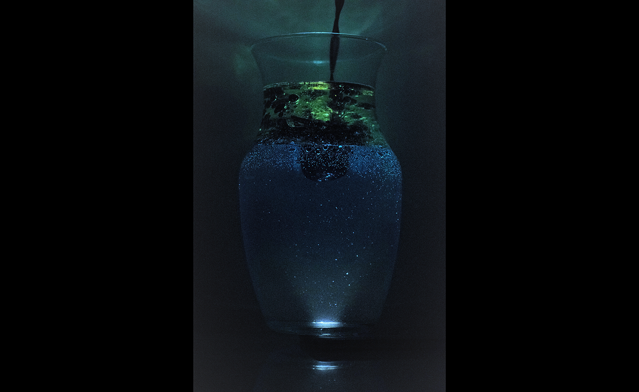
Flow of black dyed rubbing alcohol as it breaks through layers of golden vegetable oil and blue dyed water. To find the full report of this experiment see the link below.
28 Comments. Leave new
Wow, this is cool. The different colors are very cool, I think if the water wasn’t as dark, the details on the rubbing alcohol would be more visible. The background and lighting are very effective in enhancing the picture.
That looks like something that I would want hanging up on my wall if it got cropped in a bit! It’s like a bunch of stars at night or a galaxy in space. Very good looking image and it has the proper lighting with a solid background. I wonder what it’s reflecting off of at the top and how you could eliminate that.
Your image is well composed and the lighting gives a pleasing contrast. It reminds me of space or an aquarium, because of the vibrant blue and green liquids, the caustics above the vase and the way the bottom of the image seemingly fades out at the bottom (‘m guessing our class projector has less dynamic range than the photo actually contains). Why did you choose to light the image from underneath the liquid? Was is difficult to work on a larger-scale demonstration like this? I’d try inverting the colors of the image to see how the aesthetic changes.
The lighting from the bottom was a very interesting choice. have you thought about playing with this in post. limiting the in between colors? I also liked the light cone that fills the vase then fallows its contours.
Great design of the composition. The bubble reflecting the light makes it like the vase contains a part of universal.
This is cool, I like what’s going on a lot. I think with a better camera, it could look really cool. The lighting setup was creative and made it really stand out. Perhaps setting up the lines to be perfectly symmetric would help a lot. The color is also really cool and helps exemplify the flow
The aesthetic of the image is awesome! The lighting from the bottom was a great idea and I think it added a lot of clarity to the image. Do you think less water and a little more vegetable oil would add a larger volume to see the flow phenomena?
The sparkle created by the light shining up through blue water is really cool. I was wondering what created the green cloud like effect when the iso disturbed the oil. I think a picture in between the one we see here and the one shown in class would be good because I like the vibrant “magic” look of the high def image but I also like being able to see each individual component as you can on the website.
This is beautiful, and very ethereal. I like how you chose to light it from the bottom, the particulate and visible light beam in the water adds to the feeling that it was taken at the bottom of some alien ocean. The flow is clearly described and makes the experiment very repeatable. Honestly it’s really great.
The use of 3 different liquids is interesting because you can see the different buoyancy interactions. I like the darker image on the projector screen as it seems more dramatic with the light coming from the bottom. Maybe darken it in post.
I really like the almost “space” feeling of the picture because of the bubbles. It’s also a very interesting concept, the fact that once the alcohol gets past the oil it diffuses into the water.
This is a really strong image! It is really artistically created, and it is clear to see the different levels of liquids. Like someone mentioned, you could play around with color correction – the oil looks kinda green right now, which could be what you’re going for, or you could try and make that more of an “oil” color. Nice job though!
The picture looks really cool. I like how you added the light at the bottom in order to see all the different bubbles and colors. I also liked how you used more then 2 liquids, it makes your picture stand out.
I liked that you introduced a third media. The black isopropyl gives great contrast to the colors and it forms that plum entering the bottom layer really is cool.
I like how the background is really nutral and doesn’t take away from the foreground.
The underneath lighting gives a nice glow to the isopropyl alcohol! The image is a bit dark however and could potentially use color editing.
This is a beautiful composition with a lot of rich color. The high shutter speed seemed like a good choice as it catches all the small bubbles in good clarity. The lighting seems a little low and inconsistent so it could be useful to increase the wattage of the lighting and thus increase the contrast in the image.
Very cool idea! The lighting idea was cool. I wonder if you could make the differentiation between the liquids more clear. Maybe you could try cropping as well
I like how the chemicals are mixing. The mixture looks artistic. The only down thing is that the picture is kind dark.
I like the color difference between each layer. The angle for the light is pretty good.
The multiple colors of this photo add a lot of depth. The dark contrast is beautiful and the light coming up adds a spacey feel to the image. I would try to get more light next time from the bottom to see a little more detail.
I like that you embraced a much darker image than the majority of the other posts. The sparker within the water gives a very cool effect. This gives a very “space” like feel. Possibly crop out the bottom lighting portion if you don’t think it is necessary to the photo.
I like the different colors in this photo. I like how the shadows bring out the highlights. The details in the flow are nicely visible.
The blue really pops out in the photo and the lighting from the bottom of the glass has very cool visual effect! What kind of light did you use to light up the bottom of the photo?
This image is a little too dark to see what is going on with the fluids but the lighting gives it a very unique look. The glow coming off the top makes it look very nice as well.
It has a nice distribution of color, especially with the blue light shining through the bottom. The photo is quite dark, maybe this could be improved as it makes it fairly grainy and seems like the pixel density is not as sharp. Maybe it could have more cropping to get rid of the outside edges more. Looks very cool!
Like to the editing to the photo the blue and the green stick out nicely. Nice work with the lighting illuminates the contents of the photo well. Would be nice to have a stronger contrast between the edges of the vase.
Good background choice. Contrasting blue and green are nice to look at. Almost looks like the starry night sky in the bottom. Good job