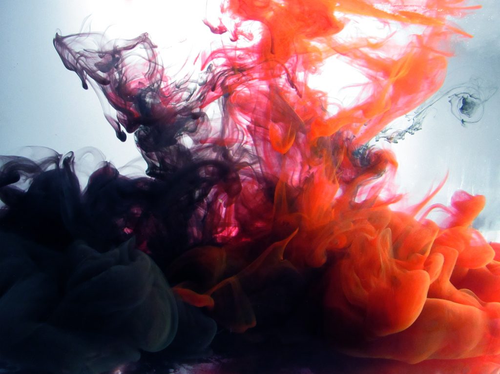
This image captures a beautiful collision between black and red India ink inside a filled fish tank, squirted out using syringes. Team 1 contributors: Antonio Gueretta, Salah Ammar, Abdullah Alsaffar, Jason Fontillas.


This image captures a beautiful collision between black and red India ink inside a filled fish tank, squirted out using syringes. Team 1 contributors: Antonio Gueretta, Salah Ammar, Abdullah Alsaffar, Jason Fontillas.
Search

22 Comments. Leave new
The puffiness of the colors make it look very neat. I like the flow represented here
I love the colors you chose and how clear this image came out!
It is really nice how you focused on the interaction between the two clouds.
I like how the texture are represented in this image clearly. It looks smooth and has a great depth to it.
Great image, I really like the focus on the ink clouds, the flow is great upwards and the transition of the heavy to whispy flow is well captured.
Great image, I love the volume contrast between the whispy ink at the top and the full volume at the bottom.
The colors you chose are wonderful.
The contrast of the india inks is beautiful. The use of rule of thirds really comes through in this image.
Cool photo, I like how the scale looks bigger than it actually is
I really love the mix and the turbulence. Good job on the clear picture and the depth of the colors.
This image is great! The collision of the two colors is just cool
Good texture on the photo, the red ink really goes well with the black
Framing of the ink is great to show the the black and orange in equal proportions
Nice job capturing the mixing gradient of the two colors and the water, along with the symmetry of the photo.
The black and red ink separating in the middle/top of the photo looks like two ghosts/spirits fighting. The color contrast is very nice.
This gives a very Halloween feel, which is very fitting for October! The colors almost look like they are fighting, which creates a cool effect.
I like the color choices and how turbulent it looks. It looks like an explosion
I like the gradient displayed from black to white. I also like how the bottom half of the image is dark, while the top half has a bright background.
I love the point where the ink jets meet, the color is fantastic!
seeing the diffusion of the two colors is very interesting. I also like the colors chosen for this image.
I like the symmetry and balance of red to black colliding. Really interesting photo!
The mixing of the two colors in this shot is really nice, I like how it is balanced with the same amount of black on the left of the photo as there is red on the right of the photo.