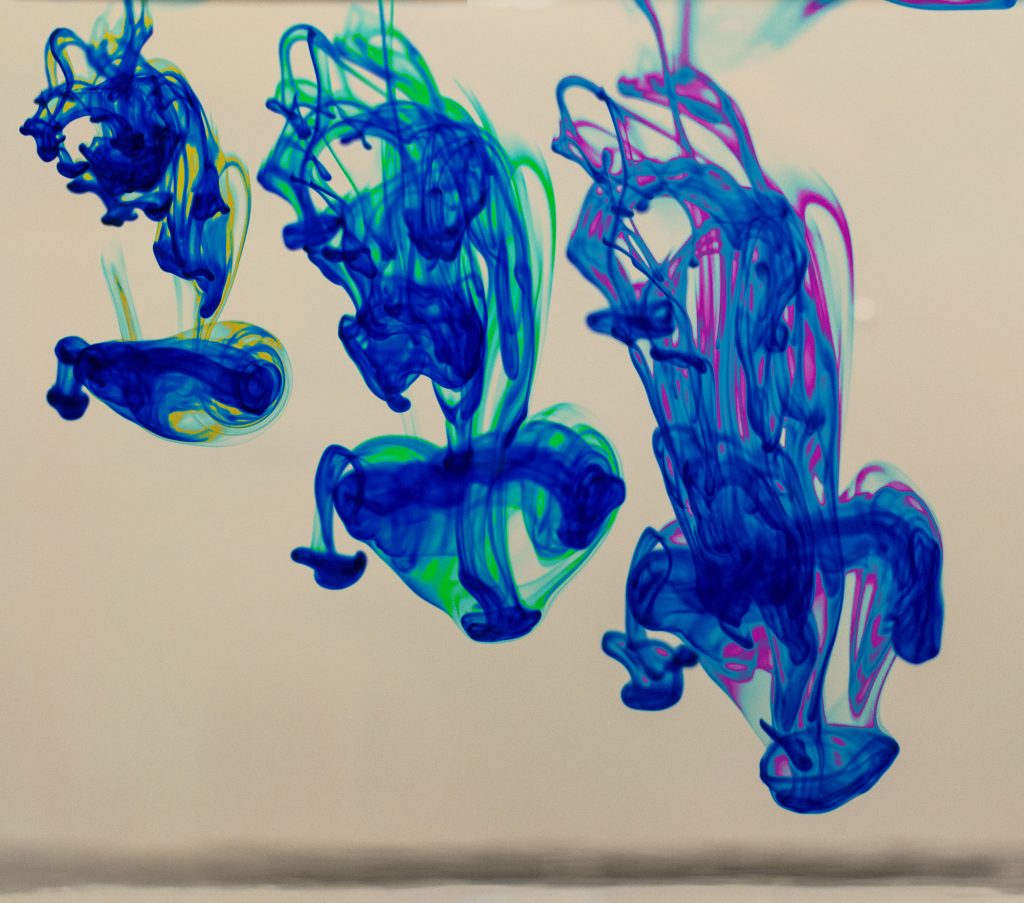
Progession of food coloring mixing in water
I took this image for the Team 2nd assignment in the Flow Visualization class at CU Boulder. The goal for this assignment was to capture the behaviour of water soluble dye mixing into container of water. Thanks to the rest of Team 5 for their assistance and for providing the tank and dye.
For this assignment we introduced drops of food coloring dye to water in a transparent plastic fish tank. The dye container allowed us to control the number of dye drops added to the water. Food coloring dyes are derived from petroleum. The molecules that make up the dye are designed to be water soluble so that even mixing occurs; the ionic bonds that keep them together are undone and the ions associate with polar water molecules (Rohrig). The Reynolds number for the flow in this image can be approximated will the following equation.
Re = udv =0.01m/s*0.05m1.004*10-6m2/s498
The low reynolds number indicates the flow is laminar. Fick’s first law of diffusion describes the rate of diffusion of the dye in water, however, because we didn’t take any measurements during the shoot we can’t calculate anything.
We set up the fish tank in conference room number fifty one in the Idea Forge, also known as “Area 51”. The lights in the room were bright enough that camera flash wasn’t needed. We placed the tank at the end of the conference table to use the wall as a white backdrop. The only issue with using the wall as a backdrop was that it showed up as an off-white in the images.
The camera I shot with was a Nikon D3100 mounted with a 35mm prime lens. The shutter speed was 1/200, aperture f3.5, ISO 800 and automatic white balance. The camera-subject distance was approximately one foot. When editing the team first images I learned how to crop, drag, and drop images onto one another. However I still had trouble making an adjustment that would equally affect the superimposed frames. Specifically, in my team second image I wanted to lighten the background color. After discussing the issue with other students, I learned that the best way to go about lightening the background color was using the color replace function at the top layer in the editing palette. I could select the off white tone of the background and shift it to bright white. To highlight the mixing happening at the plume boundary I used the color replace tool to change the shade of blue to yellow, green and pink.
By patching three images together my intent was to produce an interesting progression of images that gave the viewer a more dynamic sense of the phenomenon. During the shoot I did not record any measurements which would have allowed me to estimate quantitative values for the rate of diffusion of the dye; however, the image turned out to be aesthetically pleasing which was one of the team’s main goals.
References:
Air absolute and kinematic viscosity. (2016). Retrieved from http://www.engineeringtoolbox.com/air-absolute-kinematic-viscosity-d_601.html
Rohrig, B. Eating with your eyes: the chemistry of food colorings. (2015) Retrieved from https://www.acs.org/content/acs/en/education/resources/highschool/chemmatters/past-issues/2015-2016/october-2015/food-colorings.html
19 Comments. Leave new
Spectacular colors! I love that the dye looks like little soldiers diving into the abyss. The contrast of the image is really aesthetically pleasing.
Very very cool image. Your post processing was great on this image. I like how you left the shadowing caused by the flow. Your white background really adds to the image. The blue color gives the image a futuristic and surreal quality.
Art: The contrast between the background and the mixing process of the dye is great. I really enjoy the slight color accents that were used to highlight some features in this piece.
Flow: The flow is quickly understandable and recognized.
Photographic technique: The focus and the depth of field used in this piece is perfect.
Nice time progression of the plume. The shapes are very appealing and the color replacement adds an interesting element to differentiate the three frames. I would prefer the image without the dark bar at the bottom however.
This is a really excellent shot. It is super interesting to watch what looks like the progression of the dye. it is cool how you can predict the flow rom the left towards the right and see where the progression will lead.
Really nice to see a time progression merged in this way so that it appears to be 3 flows developing in the same image. One possible change would be to crop off the very top of the image, as the flow peaking in from the top is a little distracting. Image is well focused, and seeing the shadow underneath the dye is pretty interesting.
The colors you used and the editing done during post processing is superb.
neat progression. the color differences keep the frames unique and interesting.
I love how you can see the fluid “moving” through the water. It is also possible to crop out the bottom streak.
Very crisp photo and the progression image works well. I disagree, because I think the grayish white background fits well with the colors.
It is fascinating the way the yellow color turns to a pink as time goes on. Removing the black stripe at the bottom would aid the composition and help keep the eye focused on the drops.
The time lapse progression is a very appealing way of representing the flow captured. The colors are little over saturated, particularly in the right image between the blues and the pinks. You may also consider removing the little blush of color in the upper right corner of the right image.
Really beautiful photo, looks like 3 jellyfish. Love all the color interactions in the photo. Nice touch with photoshop. Love that you can see the movement progression.
Interesting to see the two flows on the right having similar shape. I like how you were able to get different colors in the flow. Great detail and focus.
Cool image. I don’t like the background much. I like the colors and editing. Great work!!
Nice photo, I like the shadowing of the fluid flow. I like the overlapping of the image longitudinally. The post processing of this really nice. The fluid flow is really nicely represented. Awesome photo!
I really like the progression style you choose. Its neat to see the iterations of this flow phenomena and how it changes in time.
Nice sharp images and colors. Interesting to see the multiple colors in each flow. I really like the progression effect. Background color isn’t too bad either.
1. The image is artistically very interesting with the progression.
2. The fluid physics are well shown.
3. The photographic technique is very nice and I like the hues of blue.