By Preston Marcoux for Get Wet 2016
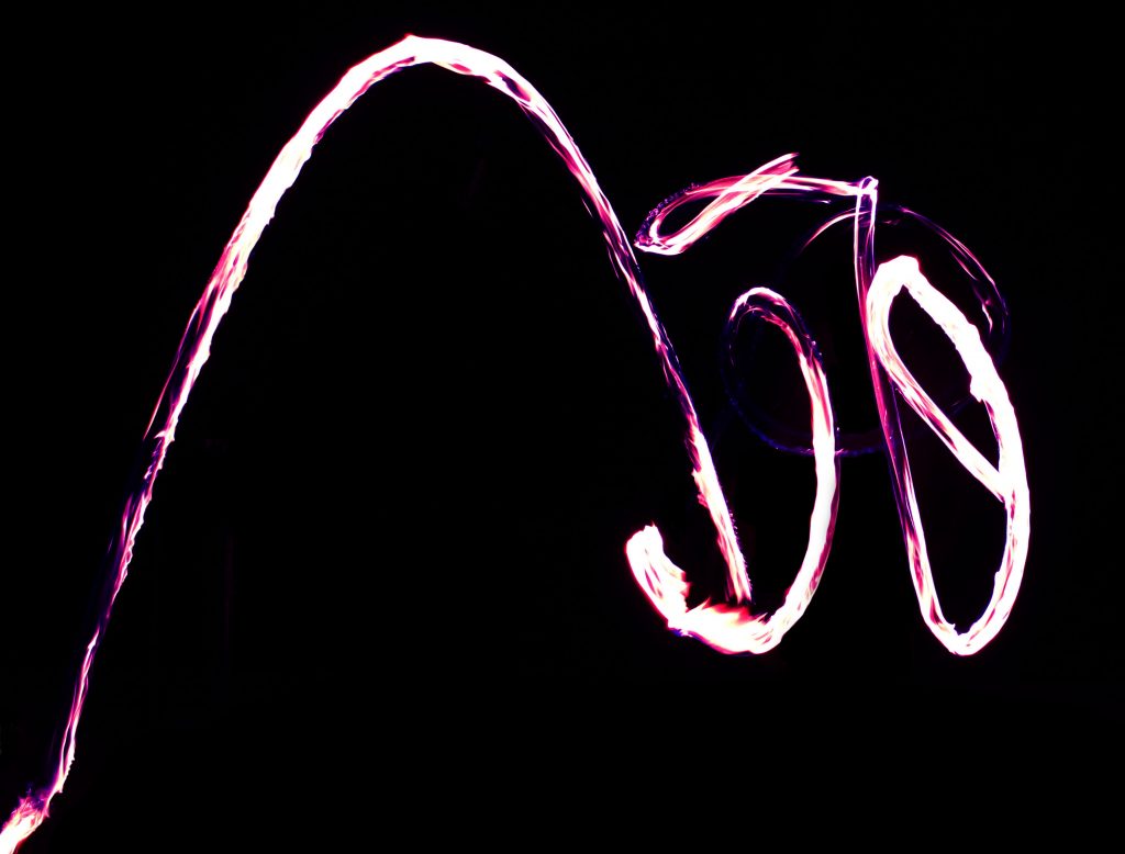
Three juggling torches in a time exposure: one is dropped. Can you tell which one?
The full Get Wet report can be found here.
By Preston Marcoux for Get Wet 2016
Three juggling torches in a time exposure: one is dropped. Can you tell which one?
The full Get Wet report can be found here.
28 Comments. Leave new
Great editing, I like how you altered the color of the flame from saturated white to blue/violet. On the pitch black background this almost looks like a symbol.
I love the contrast between the purple-ish white light and the black background. The juggling of fire torches was a great idea and you did a wonderful job editing the photo to create the color and remove yourself from the background in the original image.
1. Artistically very interesting and beautiful.
2. The post-processing to remove the person highlights the physics.
3. The photographic technique (especially the post-processing) is extremely effective and well done.
This is a very interesting flow pattern. I like the contrast of the image and the shape you constructed out of your fire dance
I love the color; it gives the image an almost magical feel. The editing was well done. It’s great to see how “mistakes” can create an unplanned masterpiece.
Cool photo and it looks great with the black background. A few of the flames look a little over exposed, so would lowering the white level bring more of the colors into view?
I would say this image is elegant because it seems like someone is trying to create a letter or word by brandishing a glaring ribbon. A long shutter speed might’ve been used to achieve this.
My favorite of the fire photos. The flames almost look like brush strokes on a canvas. I like how you brought out the different colors in the flames to produce this image. Great work!
Wonderful contrast between the fire lamps and the blackness of night. Well done long exposure trails on the fire. Nice editing to just show fire instead of human, and to make the fire blue and pop.
I like the color of this photograph, and the contrast: bravo! I’m not sure if I can really extract a clear fluid flow from this photo, but perhaps I’m not looking in the right place for it. The photographic technique is awesome, very professional looking.
The post processing on this photo really enhanced it. The removal of background distracting elements and change in the temperature/coloring of the flames both improve the artistic appeal of this piece. I also find the shape of the flames aesthetically appealing. The fact that the image has more going on in the right half and plenty of negative space on the left side makes this image what it is in my opinion.
The picture had really good contrast with a varying range of color. The photo is very focused. I like that there is only the flame trail in the picture.
Fantastic image! And you did a great job editing the original to get to this point. The contrasting whites and light purples on a black background are very dramatic. I also like your story about how you captured the original image. How many attempts did it take to get the perfect shot?
1. It looks incredible
2. The purple color actually looks really cool
3. Great job on the editing
Good contrast having a pitch black background and the bright flames. Looking at the image alone it is difficult to tell what is occurring, but looking at the intensity of each segment is interesting. Great use of long exposure.
I love this photo is the result of a torch getting away from you. You can follow where the juggling was going and then that arc just draws your eye. I love the color you brought out in the picture. Photo quality is nice and crisp.
I appreciate how this almost looks like a painted picture, Looks almost like a brush stroke. I like how the path of the flow is visible through long shutter speed. I like the substantial editing to remove distractions from the flow.
Really cool photo. Doesn’t even look like fire at first which is interesting. The focus is really cool and the fact that you messed up in the photo but it is the one you ended up using is really cool. The framing is nice. You can really see the motion in the photo. I like the color choices. Not too dramatically changed but makes it more interesting.
The image does a very good job of pulling out the colors from the orange dominant flames or the original image. The arc pattern looks like some kind of glow in the dark signature. I would have assumed it is a smaller scale if I did not know the context of the setup.
Art: The color contrast between the fire and the background is great, the post process editing focuses the attention on to the fire rather than on other distracting objects.
Flow: The flow is not quickly understandable but can be recognized after a brief period of time.
Photographic technique: The focus on the fire is very effective.
Hard to tell what is going on in the image, but has a very interesting flow. Good contrast and use of edited colors.
Very neat patterns from fire and they look really cool with the background completely black. Good contrast range and colors are very vivid.
Contrast couldn’t be better, with the darkness of the night to the white of the fire. The extended time showed in the photo gives it a pleasing outcome. The omiting of the person in the photo adds a mysterious effect.
Image is aesthetically pleasing as the purple in the streak brings out pleasing colors. The flow can be easily followed. The contrast was edited such that the person was taken out of the image.
A. Very interesting texture to the light trails in the image
B. Very clearly illustrated
C. Good work with the long exposure allowing the trails to be seen
Art: Love the differences in the white and purple colors
Flow: Im impressed with the change from fire to purple.
Photographic technique: Possibly more contrast.
– Great use of contrast with the fire.
– Looks like a signature of someone’s name in fire.
– The purple trim on the fire adds another depth of color to the fire.
The color of this image is certainly unique. The way the flame stands out from the background is satisfying, but it isn’t totally clear what is going on. The way the flames seem to ‘stop’ and ‘start’ is very interesting.