By Brett Sibel, for Get Wet 2016
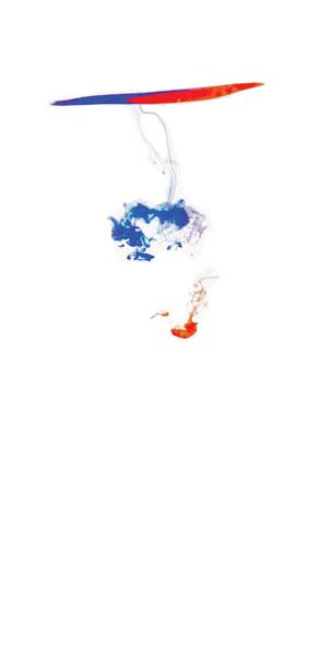
Red and blue food coloring dropped into a glass of water shows the ‘umbrella’ instability
More information: BrettSibelSep28,2016903AMGetWetReportBrettSibel

By Brett Sibel, for Get Wet 2016
Red and blue food coloring dropped into a glass of water shows the ‘umbrella’ instability
More information: BrettSibelSep28,2016903AMGetWetReportBrettSibel
Search

23 Comments. Leave new
The plumes of dye below the pool at the top make for a very beautiful image. Removing some of the dye in between the plume and non-mixed dye give the image an interesting effect.
Very nice artistic effect of this photograph. This flow is very well represented. Nice photographic technique.
1. Artistically the delineation between the red, white, and blue are excellent and very effective.
2. The flow is clearly illustrated and the details are visible and creative.
3. The photographic technique is well done and the stark white background is fantastic.
The white background makes this image simple and beautiful. It really helps to isolate the fluid, nice job
The extensive post processing really makes this photo for me. Leaving nothing but the white and the colors lends a wonderful appeal to this photo. I love the simplicity.
It’s disappointing that the image quality for this submission is so poor because it looks like a really cool photo. Please upload a better quality image. From what I can see the colors are great, the plumes in the water have interesting structure and the background was effectively eliminated. In addition to uploading a higher quality image I would also suggestion cropping out some of the empty space off the bottom of the image.
Great choice of color. They compliment each other well on the white background. I like that the different clouds of red and blue are so distinct.
You did a great job capturing the effects of surface tension. I would like to see the higher resolution picture. The image is so simple, but so effective. The large amounts of white space are used effectively to highlight the dye.
Great post-processing to create the white background and bring out the colors so it looks like the dye is floating. Why does the red dye not leave a trail like the blue dye?
I like how the image shows the two sides at the top and then mixing as they collapse in the center. I like how it is just the image flow of the dyes mixing on a white background to draw your eye to the flow.
Fantastic image! I like your choice of keeping the top of the image, where the red and blue food coloring contact each other but do not mix. The differences in surface tension create an amazing yin-and-yang effect on the surface.
I enjoy the choice in dye colors as you can really tell what is going on. That is an interesting concept how the time of day really impacted the photo.
Excellent contrast between the background and the dyes, also ‘merica. Interesting effect with the surface tension and the dye flow in the fluid. Possibly crop out a bit more of the white space in the future.
The simplicity of the photo works very well. Leaving the top in the photo, while removing the glass from the photo gives it an alive feeling.
I appreciate a the background and how it creates a large amount of contrast. I also appreciate the the minimal amount of mixing and how that creates a large amount of contrast between the colors of dye.
I like the color formation on the top. Interesting to see how the different colors separated into two different flows. No distracting elements.
1.Really cool image ! visually stunning
2. I love the contrast.
3. I would like to see a crisper image but really interesting
I agree the blue and red is very interesting that they do not mix. I like how the photo captures the whole effect not just the plumes. I would be interested to see the real full resolution image.
Art: The contrast is done well and the main component of the food coloring looks like a UFO of some sort.
Physics: It’s surprising how the red and blue remain completely separated from each other.
Photography: Good centering of the food dye.
-Cool effect with the different colors of dye
-Plumes traveling downwards from pool of dye is very neat
-Great contrast range and the white background looks very professional
Art: The color contrast between the food dye and the background is beautiful. I love the colors that you used for this mixing as it improves the visual aesthetic of this piece.
Flow: The flow is understandable and easily recognized.
Photographic technique: The capture of the mixing of the food dye is really well done. The initial plum is well developed and beautiful.
The color choices red and blue go well together. The image also demonstrates great contrast between the dye and the background. However, the image is blurry and difficult to see the fluid flow.
– The contrast on this piece is cool, the red and blue separate and provide a simple and clean look to it.
– I was surprised that there is no purple in the photo with the mixing of red and blue.
– The intent is simple and the white background helps enhance the image and doesn’t show any other distracting elements.