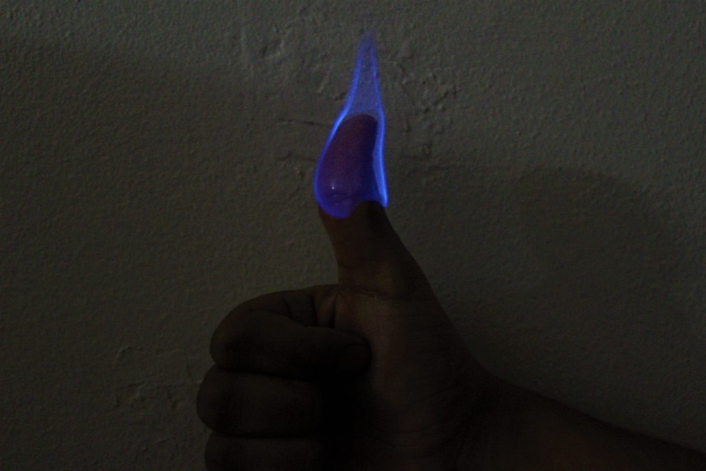
Art: Interesting concept to have the thumb on fire saying good job while everything is still burning.
Flow: Good shot of getting the flame at its peak. I was impressed you said schnapps was able to stay on fire long enough. I wonder if flavor of schnapps would change any of the colors.
Technique: A little more work into lighting could really make this photo go a long ways.
Art : I think that the thumb and the flame demonstrate your bravery.
Flow : The tip of flame perpendicular to ground even if your thumb is tilted
Tech : The flame is well focused.
– The intent was realized heavily as the contrast with the fire and thumb clearly as the subject.
– The flow clearly illustrates phenomena of controlled but ‘wild’ flow using handsantizer as the controller
– The exposure was clearly minimal as the image is darker, this was done to make the flame pop.
Art: I think this piece of work did a good job of creating interesting picture and made me question the science behind this picture.
Flow: The picture was understandable. It is also reproducible because picture itself clearly illustrated the phenomena.
Technique: I believe that if this picture was more focused on the fire, it would be better because it would make the audience be more focused to the content.
Art: Intent was realized, the flame’s shape looks like the shape of the finger!
Flow: Flow is so controlled! nice try!
Photographic technique: The hand is kind of dark, it would be better to use a better lighting.
This is such an interesting image!
Artistically, the capture is interesting and makes me think of the symbolism behind “liking” things on Facebook.
The flow is fascinating and unusual! Lovely!
Technique: though the focus is sharp (which is hard to do!) The lighting could be improved. Your idea of a black background sounds good, and it could also be good to have some direct lighting on the hand to make it more dramatic.
I like the way you compose the image, the hand/thumb right in the middle, the reflection of the camera is actually a highlight. It has no distracting element so the audience can focus on the flame. I think if you can highlight the flame(decrease the background light) on the top part of the image will make the image even better. The flame in the image is sharp and focused.
The intent was realized with the image pictured. Cropping and background changes would aid in focusing in. The details are visible as the flame is ignited around the skin with alcohol on it.
Art:
I think this image is simplistic which lends itself to the nature of the image well, and the blue really pops out.
Flow:
I feel like the flow has a lot of interesting components in it, but I don’t quite understand how the physics works without burning off your thumb.
Photographing technique:
While the image is purposefully focused, the rest of the image comes off too dark. I think if the image had more color throughout then the image would be improved. However, too much color would detract from the flame so it is important to find the balance.
The art is beautiful, it’s out of the ordinary to see a thumb on fire so it stands out well. The flow looks good, I’m sure that the picture had to be taken quickly to capture the flow well. The lighting was low but this highlighted the flame well!
I like how creative the idea was, and the result turned out very cool. I think you could improve the cropping by focusing either on the thumb alone or the whole hand. You could also choose a smooth white/black background to reduce distractions.
I thought it was a cool idea that immediately grabs the attention of the person that is looking at the picture. I also really like the color of the flame. The gap between the flame and the thumb at the top of the thumb that is created by the water evaporating from the heat of the flame is also a very interesting. The focus was also very good. Why didn’t you use a solid background and why didn’t you crop the image at all.
I really like this picture, it is beautiful and interesting. Alcohol burning on his thumb s very interesting and flow is understandable. The shadows detailed and focus is good. Very nice picture
the art is effective and and the color of the flow is very pleasing. I think the background could be less detailed or blurred out. overall successful but photography technique could improve!
I really like the way that the flame forms to your hand. The picture is in great focus and looks nice and clear. The texture of the flow looks very smooth and it clearly demonstrates what happens when you burn relatively high proof alcohol. One thing I was wondering about is why you chose a plain wall as the background, was there a reason for this? Overall cool picture.
The blue glow of the fire looks sublime! The blues could be enhanced as well as exposure. The juxtaposition of fire and reflective liquid is a creative statement. The thumbs up represents risking safety, which is cool.
Art: the image was pleasing eith effective colors. Really liked the contradt between the background and the flame.
Flow: the flow was understandable with demonstration of alcohol and water evaporation
Photographic technique : really enjoyed the full contrast of the video
I love the concept! I want to try it…I think the shadow is a little distracting so maybe you could find a photo where the shadow is less noticeable! I even like that you used that color wall..I think he black would of made your hand fade into the black.
I feel that the piece achieved its main objective artistically which was to show clearly the combustion process without distractions. The flow itself was very clearly shown. Photographically, the image could have been lit better.
The flame is really cool and smooth. It demonstrates the flow of the flame and how it curves out at the bottom. I like that it is blue because it is a bit ironic that it is a hot flame, yet does not look it. It might be worth playing with the angle of the arm with respect to the hand and thumb.
The bright blue color looks really cool with the dark background. The flow phenomena is understandable and very original. I have not seen another picture like this on this website so far. Did you edit the contrast at all in photoshop or another photo editing program?
The contrast between the flame and the background highlights the phenomenon going on, the flow is illustrated well and the image could maybe use a little more light on the hand. Overall, really cool!
I like the contrast of the blue flame with the dark frame. It makes me want to attempt it as well. The depth of field is also very clear since we know the size of a human hand.
In the future, you may want to try a background with less texture, as it is a little distracting. I also wonder if different lighting would be better.
Art: Shape of the flame makes for an interesting effect
Flow: Exposure time makes for a smooth flame shape
Photo Technique: TBH not much thought put into the background it seems, lighting is fairly dim
Art:
(1) Intent was realized in this case since the photographer decided to ignite fire on his finger
(2) The distracting element in this photo is the wall background
Flow:
(1) Flow is controlled, however, the details could be more visible
Photographic technique:
(1) Better background would be beneficial and increase in exposure
This post is certainly interesting and catches the eye. This image certainly demonstrates what happens when something is dipped in alcohol and lit on fire. The small area above the thumb that isn’t engulfed is interesting. The photo is pretty dark, however.
This project is highly creative. The bright blue of the flame stands out and the subject of the picture is the immediate focus. I like that the light is reflected on the thumb because you can see that the liquid is on fire, not the thumb. a darker background would really pull this together.
The effect of the blue flame against the darkened background is a dramatic one. Seeing your thumb on fire is immediately startling and noticing that you are giving a thumbs-up sign provides a sort of irony. The composition is fairly balanced, and my eyes have the tendency of moving upwards in this photo.
Great composition, the blue color is very vivid in relation to the rest of the picture. A darker background might increase contrast. Very focused image to capture detail.
Art: Definitely dramatic and striking, subject is nicely framed
Flow: Clearly illustrates combustion phenomena, and the unique effects of burning something that contains a lot of water
Photographic technique: hand, background a little dark, could think about using a fill light or adjusting exposure
The color of the flame is very nice. I like how there is an outline around the flame. The flame itself is in focus and the shape is very nice. I think this is a good demonstration of a flame as the details are visible and you can tell where the alcohol on the thumb stops. I think cropping the photo would help focus the viewer’s attention on the subject.
I love the color and the framing of the image. I wonder what would’ve different if we had a more solid background with more light on the hand, however, the flame and the thumb have great contrast.
The timing that the picture is great to capture the flame. Also, the contrast between the flame and the background is aesthetically pleasing. Did you purposefully leave in the background shadows?
-Very pleasing and effective colors. I think with the black background it would really stand out.
-This was a creative visualization of flow.
-The image has nice focus, but could benefit from cropping.
This is a really interesting idea, and was pretty brave of you to do. The flame outline can be clearly seen; however, I would probably use a black background like you mentioned in class. You could also take a video of you moving your thumb around which would be cool to see the flame move around.
The thumbs up with the flame is a good image, and the shape and color of the flame are nice to look at. The focus of the image looks good, but maybe consider changing the background and the level of contrast.
The Imagery is compelling and draws interest immediately, some changes in lighting would help make the image “pop”, and maybe a tighter frame would show the areas of interest more explicitly.
Art: Love the creativity and the striking bright blue flame.
Flow: The image Cleary shows the flow of the flame, the physics revealed are evident (a pure blue flame).
Technique: Perhaps adjust exposure?
Art:
The intent was realized! It grabs me and I instantly know what it is.
Flow:
It’s cool how the flame wraps around the thumb. Your thumb is sooo shiny :) the flow is understandable and it is a creative technique.
Photographic Techniques:
The wall and shadow are a little distracting—maybe you could blur that or something. I like the white background.
Art:
– The aesthetic was very satisfying and the pure blue flame was pretty cool.
Flow:
– The tip of the flame creates a beautiful flow and the beginning of the flame can clearly be seen. I can fully understand the phenomena that is occurring
Technique:
– I thought the image was very cool and incorporated great physics. The only thing I would suggest is to remove the shadow in the background. The lighting could be improved, but overall I like the idea behind it.

50 Comments. Leave new
Art: Interesting concept to have the thumb on fire saying good job while everything is still burning.
Flow: Good shot of getting the flame at its peak. I was impressed you said schnapps was able to stay on fire long enough. I wonder if flavor of schnapps would change any of the colors.
Technique: A little more work into lighting could really make this photo go a long ways.
I like the physics in this image, however, some more thought could have gone in to the things around the flame.
Art : I think that the thumb and the flame demonstrate your bravery.
Flow : The tip of flame perpendicular to ground even if your thumb is tilted
Tech : The flame is well focused.
This is very interesting and creative. The focus is great. However have you thought of using the lighting of the fire itself?
– The intent was realized heavily as the contrast with the fire and thumb clearly as the subject.
– The flow clearly illustrates phenomena of controlled but ‘wild’ flow using handsantizer as the controller
– The exposure was clearly minimal as the image is darker, this was done to make the flame pop.
Art: I think this piece of work did a good job of creating interesting picture and made me question the science behind this picture.
Flow: The picture was understandable. It is also reproducible because picture itself clearly illustrated the phenomena.
Technique: I believe that if this picture was more focused on the fire, it would be better because it would make the audience be more focused to the content.
Art: Intent was realized, the flame’s shape looks like the shape of the finger!
Flow: Flow is so controlled! nice try!
Photographic technique: The hand is kind of dark, it would be better to use a better lighting.
I’ve never seen a thumbs up on fire – hot concept. The flame was captured well. Hand lighting could be improved to make this a legendary picture.
This is such an interesting image!
Artistically, the capture is interesting and makes me think of the symbolism behind “liking” things on Facebook.
The flow is fascinating and unusual! Lovely!
Technique: though the focus is sharp (which is hard to do!) The lighting could be improved. Your idea of a black background sounds good, and it could also be good to have some direct lighting on the hand to make it more dramatic.
I like the way you compose the image, the hand/thumb right in the middle, the reflection of the camera is actually a highlight. It has no distracting element so the audience can focus on the flame. I think if you can highlight the flame(decrease the background light) on the top part of the image will make the image even better. The flame in the image is sharp and focused.
The intent was realized with the image pictured. Cropping and background changes would aid in focusing in. The details are visible as the flame is ignited around the skin with alcohol on it.
Art:
I think this image is simplistic which lends itself to the nature of the image well, and the blue really pops out.
Flow:
I feel like the flow has a lot of interesting components in it, but I don’t quite understand how the physics works without burning off your thumb.
Photographing technique:
While the image is purposefully focused, the rest of the image comes off too dark. I think if the image had more color throughout then the image would be improved. However, too much color would detract from the flame so it is important to find the balance.
The art is beautiful, it’s out of the ordinary to see a thumb on fire so it stands out well. The flow looks good, I’m sure that the picture had to be taken quickly to capture the flow well. The lighting was low but this highlighted the flame well!
I like how creative the idea was, and the result turned out very cool. I think you could improve the cropping by focusing either on the thumb alone or the whole hand. You could also choose a smooth white/black background to reduce distractions.
I thought it was a cool idea that immediately grabs the attention of the person that is looking at the picture. I also really like the color of the flame. The gap between the flame and the thumb at the top of the thumb that is created by the water evaporating from the heat of the flame is also a very interesting. The focus was also very good. Why didn’t you use a solid background and why didn’t you crop the image at all.
I really like this picture, it is beautiful and interesting. Alcohol burning on his thumb s very interesting and flow is understandable. The shadows detailed and focus is good. Very nice picture
the art is effective and and the color of the flow is very pleasing. I think the background could be less detailed or blurred out. overall successful but photography technique could improve!
I really like the way that the flame forms to your hand. The picture is in great focus and looks nice and clear. The texture of the flow looks very smooth and it clearly demonstrates what happens when you burn relatively high proof alcohol. One thing I was wondering about is why you chose a plain wall as the background, was there a reason for this? Overall cool picture.
The blue glow of the fire looks sublime! The blues could be enhanced as well as exposure. The juxtaposition of fire and reflective liquid is a creative statement. The thumbs up represents risking safety, which is cool.
Art: the image was pleasing eith effective colors. Really liked the contradt between the background and the flame.
Flow: the flow was understandable with demonstration of alcohol and water evaporation
Photographic technique : really enjoyed the full contrast of the video
I love the concept! I want to try it…I think the shadow is a little distracting so maybe you could find a photo where the shadow is less noticeable! I even like that you used that color wall..I think he black would of made your hand fade into the black.
I feel that the piece achieved its main objective artistically which was to show clearly the combustion process without distractions. The flow itself was very clearly shown. Photographically, the image could have been lit better.
The flame is really cool and smooth. It demonstrates the flow of the flame and how it curves out at the bottom. I like that it is blue because it is a bit ironic that it is a hot flame, yet does not look it. It might be worth playing with the angle of the arm with respect to the hand and thumb.
The bright blue color looks really cool with the dark background. The flow phenomena is understandable and very original. I have not seen another picture like this on this website so far. Did you edit the contrast at all in photoshop or another photo editing program?
The contrast between the flame and the background highlights the phenomenon going on, the flow is illustrated well and the image could maybe use a little more light on the hand. Overall, really cool!
I like the contrast of the blue flame with the dark frame. It makes me want to attempt it as well. The depth of field is also very clear since we know the size of a human hand.
In the future, you may want to try a background with less texture, as it is a little distracting. I also wonder if different lighting would be better.
Art: Shape of the flame makes for an interesting effect
Flow: Exposure time makes for a smooth flame shape
Photo Technique: TBH not much thought put into the background it seems, lighting is fairly dim
I the overall idea of the image and how the flame shape forms due to your finger. It is however kinda dark and makes it hard to see the image.
Art:
(1) Intent was realized in this case since the photographer decided to ignite fire on his finger
(2) The distracting element in this photo is the wall background
Flow:
(1) Flow is controlled, however, the details could be more visible
Photographic technique:
(1) Better background would be beneficial and increase in exposure
Good Job!
This post is certainly interesting and catches the eye. This image certainly demonstrates what happens when something is dipped in alcohol and lit on fire. The small area above the thumb that isn’t engulfed is interesting. The photo is pretty dark, however.
This project is highly creative. The bright blue of the flame stands out and the subject of the picture is the immediate focus. I like that the light is reflected on the thumb because you can see that the liquid is on fire, not the thumb. a darker background would really pull this together.
Do you think it would be valuable to zoom in on the reflection?
The effect of the blue flame against the darkened background is a dramatic one. Seeing your thumb on fire is immediately startling and noticing that you are giving a thumbs-up sign provides a sort of irony. The composition is fairly balanced, and my eyes have the tendency of moving upwards in this photo.
Great composition, the blue color is very vivid in relation to the rest of the picture. A darker background might increase contrast. Very focused image to capture detail.
Art: Definitely dramatic and striking, subject is nicely framed
Flow: Clearly illustrates combustion phenomena, and the unique effects of burning something that contains a lot of water
Photographic technique: hand, background a little dark, could think about using a fill light or adjusting exposure
The color of the flame is very nice. I like how there is an outline around the flame. The flame itself is in focus and the shape is very nice. I think this is a good demonstration of a flame as the details are visible and you can tell where the alcohol on the thumb stops. I think cropping the photo would help focus the viewer’s attention on the subject.
I love the color and the framing of the image. I wonder what would’ve different if we had a more solid background with more light on the hand, however, the flame and the thumb have great contrast.
Could be lit better, but it demonstrates the phenomenon well.
The timing that the picture is great to capture the flame. Also, the contrast between the flame and the background is aesthetically pleasing. Did you purposefully leave in the background shadows?
-Very pleasing and effective colors. I think with the black background it would really stand out.
-This was a creative visualization of flow.
-The image has nice focus, but could benefit from cropping.
Seems dangerous, but happy it worked out well. The flow is unique in that it’s thermo driven. Better lighting might be helpful.
This is a really interesting idea, and was pretty brave of you to do. The flame outline can be clearly seen; however, I would probably use a black background like you mentioned in class. You could also take a video of you moving your thumb around which would be cool to see the flame move around.
An interesting shot with good focus and color distinction. Some work could have been put into the set up and lighting.
This is cool because it clearly illustrates the air flow, and is also very aesthetically pleasing
The thumbs up with the flame is a good image, and the shape and color of the flame are nice to look at. The focus of the image looks good, but maybe consider changing the background and the level of contrast.
The Imagery is compelling and draws interest immediately, some changes in lighting would help make the image “pop”, and maybe a tighter frame would show the areas of interest more explicitly.
Art: Love the creativity and the striking bright blue flame.
Flow: The image Cleary shows the flow of the flame, the physics revealed are evident (a pure blue flame).
Technique: Perhaps adjust exposure?
Art:
The intent was realized! It grabs me and I instantly know what it is.
Flow:
It’s cool how the flame wraps around the thumb. Your thumb is sooo shiny :) the flow is understandable and it is a creative technique.
Photographic Techniques:
The wall and shadow are a little distracting—maybe you could blur that or something. I like the white background.
Art:
– The aesthetic was very satisfying and the pure blue flame was pretty cool.
Flow:
– The tip of the flame creates a beautiful flow and the beginning of the flame can clearly be seen. I can fully understand the phenomena that is occurring
Technique:
– I thought the image was very cool and incorporated great physics. The only thing I would suggest is to remove the shadow in the background. The lighting could be improved, but overall I like the idea behind it.
I liked the distinct contrast between the blue flame and the background. The flame really stood out as it was the only colored object in the photo.