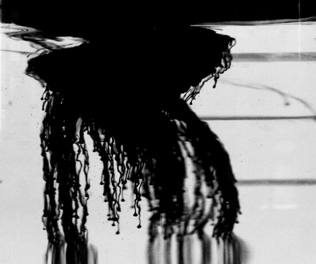
Graduating cylinder was filled up with hydrogen peroxide. Ink was then dropped into hydrogen peroxide producing flow. The Rayleigh-Taylor instability causes the ink to twist and distort due to the difference in fluid densities.
Team Third – Zachary Hinck
Search
Categories
Flow Vis Guidebook
- Introduction to the Guidebook
- Overview 1: Phenomena. Why Does It Look Like That?
- Overview 2: Visualization Techniques
- Overview 3: Lighting
- Overview 4 - Photography A: Composition and Studio Workflow
- Overview 4 - Photography B: Cameras
- Overview 4 - Photography C: Lenses - Focal Length
- Overview 4 - Photography C: Lenses - Aperture and DOF
- Overview 4: Photography D: Exposure
- Overview 4 - Photography E - Resolution
- Overview 5 - Post-Processing
- Clouds 1: Names
- Clouds 2: Why Are There Clouds? Lift Mechanism 1: Instability
- Clouds 3: Skew - T and Instability
- Clouds 4: Clouds in Unstable Atmosphere
- Clouds 5: Lift Mechanism 2 - Orographics
- Clouds 6: Lift Mechanism 3 - Weather Systems
- Boundary Techniques - Introduction
- Dye Techniques 1 - Do Not Disturb
- Dye Techniques 2 - High Visibility
- Dye Techniques 3 - Light Emitting Fluids
- Refractive Index Techniques 1: Liquid Surfaces
- Refractive Index Techniques 2: Shadowgraphy and Schlieren
- Particles 1- Physics: Flow and Light
- Particles 2: Aerosols
- Particles 3: In Water
- Particles 4 -Dilute Particle Techniques
- Art and Science
- TOC and Zotpress test
- Photons, Wavelength and Color


15 Comments. Leave new
Very interesting photo. I like the choice to make it into a grayscale image.
Very cool and creepy, makes me think of the deep ocean
I really like the way that the ink flows through the water and the little rivulets that we see towards the bottom of the flow. Great focus and the background really contrasts the ink which is nice.
Really imteresting and love the contrast
I like the choice of black and white, it makes the flow very striking and clearly visible.
Maybe the bendy strings were affected by the temperature difference between the h202 and ink.
The ink is well contrasted by the background. The ripples create an interesting flow effect. The image seems a bit unfocused, and the blurs at the bottom are a little strange.
Really nice image. The black and white works well. The wiggling trails are interesting.
The image is really interesting, I like the decision to make it black and white. The focus is great in the central part of the image. Cool flow.
Love the black & white. Great focus on the foreground and blur in the background.
Really cool image, I ike the varying focus throughout this image, it gives it a creepy feeling.
I think that black and white makes it easier to visualize the flow.
Super cool image! I really like how you can see the different strings of ink flow.
Those drops of ink are really cool looking. I wish more of the flow was in focus so I could see more of the instability.
The flow is really cool and kind of creepy in this image. The black and white is wonderful and the focus is done really well.