
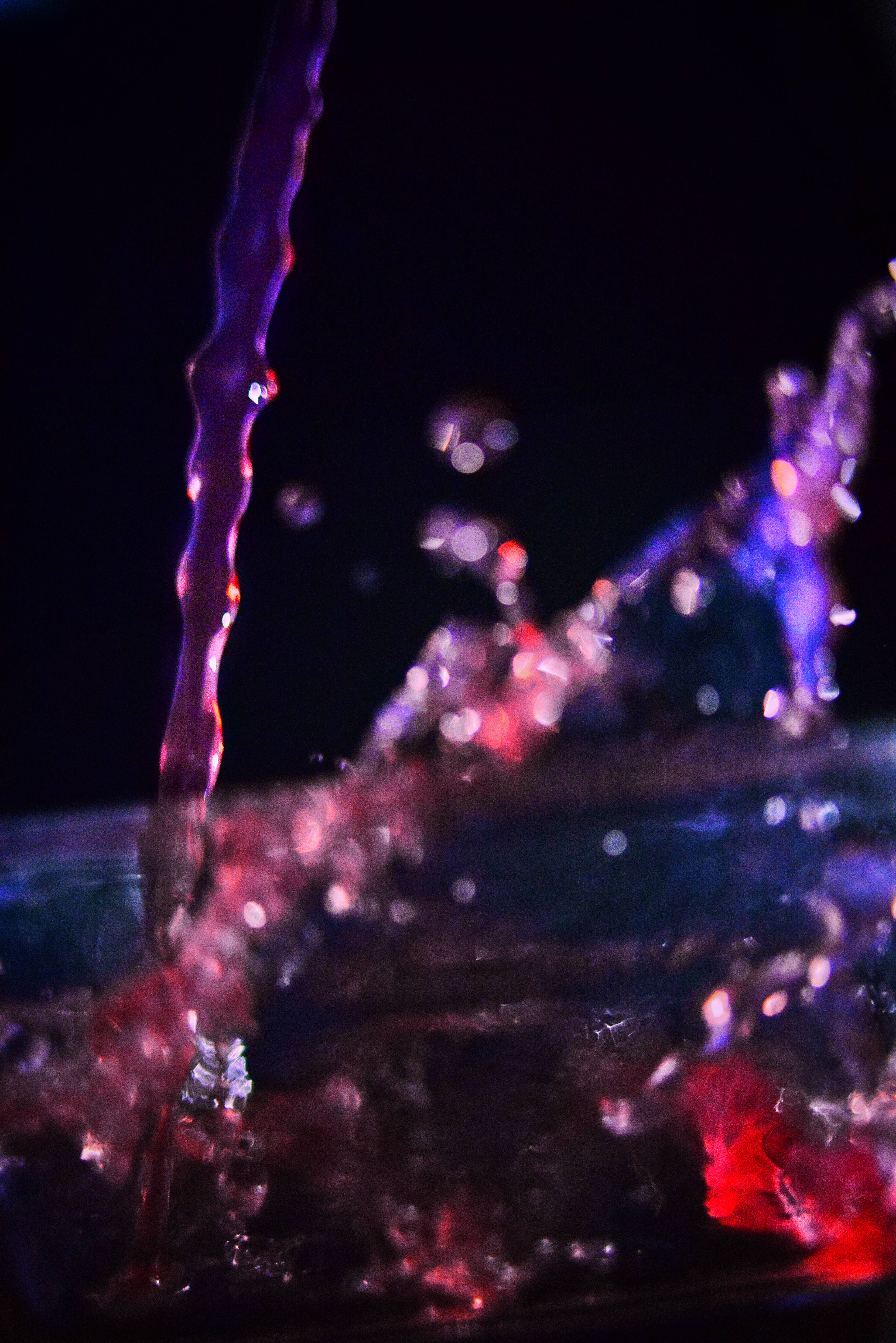
Image of cranberry juice being poured into an empty glass vase from a height of two feet. As the juice hits the base it spreads out and up the side of the vase walls. With a single light to the side it brings out many different colors and shades. I had a difficult time with focus and being too grainy due to high ISO in the low light environment.
Dylan Crane
9/12/18
Flow Visualization
Get Wet Photo Assignment
For our first project in the class, we were supposed to individually go and “get out feet wet”. This meant that we could go and try and capture any sort of flow that we could think of that we found interesting. It could be fire, liquid, gas, or other natural occurrences but we had to try our best to create a creative piece out of it. I was very much interested in the flow of a liquid and had seen many beautiful photos of splashes and droplets that it made me want to experiment with it myself and see what I could capture without any background in it.
I knew I wanted the liquid to have a color to it so that the image would have a color gradient and end up popping a bit more. I didn’t want to do anything with food coloring though as it is used in so many different projects and, while it does look great, I wanted to keep it simple and different. What better to use than what’s in your fridge already. I had a gallon of Ocean Spray cranberry juice sitting in the fridge that we a bright red and I figured it would work quite well. My hope was to capture the juice flowing out of the container and splashing off a flat surface.
So, to not make a mess I used a transparent glass vase that was about two feet tall and 8 inches in diameter as my container that I could shoot through. I also wanted the liquid to be the only subject in the image with a completely black background. This means using six 4×8 sheets of black paper to create a black background behind and below the vase, as well as placing all of this in a low light area of my house, which happens to be in one corner of my kitchen. The lighting source that I used was just my I-Phone light directly to the right side of the image.
Then I placed the camera, a Nikon D610 with a 24mm prime Sigma 1.8 lens, in a portrait setting within ½ inch of the vase and started the process of dialing in the focus, shutter speed, F-Stop, and ISO on the camera to best for the picture. I eventually landed on a shutter speed of 3200, and F-Stop of 2, and the ISO at 6400. With the settings done it was just a matter of timing the shot and the time I poured the juice. I ended up shooting 8 FPS with one hand and pouring the juice from the height of the vase with the other until one came out.
What I noticed in the photo was that the stream coming down from the container was not uniform and had sections within it that contained more liquid than others giving it a look similar to a round beaded necklace. This comes from the effect of air pressure forcing its way through the container opening and restricting liquid flow momentarily while it tries to equalize the atmospheric pressure outside the container. It does this in a cycle as the water pressure and air pressure change and overcomes one another.
While I got a photo that I like and turned out almost how I envisioned, I did have a lot of trouble with not enough lighting. I could have used a stronger light source allowing me to increase my F-Stop and lower my ISO to improve the look of my image and its grainy blurry nature I was trying to get a crisp but smooth and calming look to the photo and I think it turned out more intense and flashy instead because of the lighting. I wish I could have had all of the liquid in focus but that meant the aperture would have made the image too dark. Same with the ISO, it was grainy even on the portion that was focused but if I were to lower the ISO it would have been too dark. I tried to combat these as much as I could in post-production, but it had little effect by the time I had made it light enough to see what was occurring. If the future to improve on this image I will use a camera strobe to improve the lighting.
29 Comments. Leave new
This is probably my favorite picture! I really like the colors and much it makes it pop! I think you capture the splash that you were looking for really well!
Great picture. The colors and the overall picture is great to look at. the motion of the fluid is great as well
The oscillating flow of the falling stream of juice is enchanting. How close was your camera to the glass? In the bottom right corner, the splash of red liquid on the interior or the glass creates some beautifully sharp caustics. All of the colors in frame compliment each other and mix in a visually pleasing way. Even though the light may have been dimmer than you hoped, I think it benefits the mood of your image and results in cool-looking bokeh specked throughout the image.
I really like the color contrast in this image. The lighting and focus could use some work though. I also think you could widen the image just slightly or add black boarders to give more negative space.
The sharpness of the falling fluid is wonderful. You captured great color through the falling fluid as well. The black background. The out of focus fluid that resulted from the splash is somewhat distracting from my view. Great photo!
It’s a nice composition of the image. Pleasing colors makes it unique. While there is a bit loss and noise in the focus due to the low light environment.
Really cool mixing of colors. It would be interesting to have the full splash in focus as well. Great picture idea.
This is a very pretty picture. The colors are really great, none of them really stick out over the others and it creates a very cohesive color palette. My only complaint would be about the focus. I can see vague shapes of the splash and the pour stream and I think that clear visualizations of that would really take this to the next level.
I like the color contrast and the focus to un-focus of this image. It captures a lot of motion. have you thought of having light underneath the splash?
I really like the color scheme in this photo. The black background gives a really good contrast and let’s the viewer focus on the fluid.
I love the colors and forms in this photo. Great thinking making the background black. It sets a nice contrast to the vibrant colors of the cranberry juice. Using a wider field of view could allow the splash to be more in focus if coupled with additional lighting to compensate.
The colors of the juice are really cool, and the splash is spectacular. I think the splash is arguably more interesting, so maybe trying to focus on that would be more beneficial. I think different lighting would be helpful. Cool picture!
I think to contrast between the colors and background are very cool. The black background was a good choice. The splash is a little blurry. Maybe more lighting would help
The graininess and focus make it difficult to distinguish what is happening in this picture but the colors and the flow of the initial pour are captured well. I think a brighter light would help a lot in this case.
The colors look very fresh with the blue and red mix. The lighting looks nice even though it complicates the focusing and the camera settings. Maybe try capturing an image before the splash back happens.
The amount of color in the picture is awesome. Try to fix the focus a little more but this setup has huge potential
I love the variety of colors that are in this photo, and think they really are what make this photo exceptionally beautiful. Changing where your focus is could be helpful.
The color looks great. The lighting on the liquid is awesome. The background liquid is little bit blur but still looks pretty good. It actually helps eyes to focus on the front liquid.
I really like the colors and diverse range of brights and darks of this image. It is super engaging and dynamic, which is awesome. The only thing for me is that the image is a little distracting as in I’m not sure what is the main focus. The stream seems to be the most important, but at the same time, I think it would be helpful to have either everything in focus or have the parts that aren’t the stream even more out of focus. But overall, good job!
The colors going on here are super eye catching and I honestly thin your lighting was not bad. The one thing I would improve is getting more of the image in focus because the splash feels like the subject of the image but is super blurry.
Love the colors of the cranberry juice! The focus on the back stream of photo adds an interesting view of the flow. Where does the blue coloring come from?
I like the colors that you used during the time of taking this. the only thing that throws me off is the solid strands of water because they remind me of small sticks.
You were able to get a great contrast and colors showing through, which is quite impressive. You seem to understand the drawbacks of the low light and have a great plan to fix this. One of the better images I have seen and it seems like you put lots of thought and effort into it.
Like the nice contrast between the cranberry juice and the black background. Curious how so many colors came from the juice as I only think of it as a solid color. Like the ripple in the pour.
I’m lovin the colors on this, it’s very rich! I think you’re right, it would be cool if you could lower the f-stop to get more in focus. Otherwise, super cool!
Simple but very well done! I particularly like the wavy feature of the main steam all highlighted with the different colors.
I really like the colors that came out of this image. The cranberry juice has awesome tones of pink, purple and blue that really contrast well against the black background. As you mentioned the focus is tough to get on something moving this quickly.
This image has great color! I like the motion of the fluid. The contrast with the black background is nice!
The color scheme in this image is really nice to look at! The background definitely helped make the flow the focus of the image.