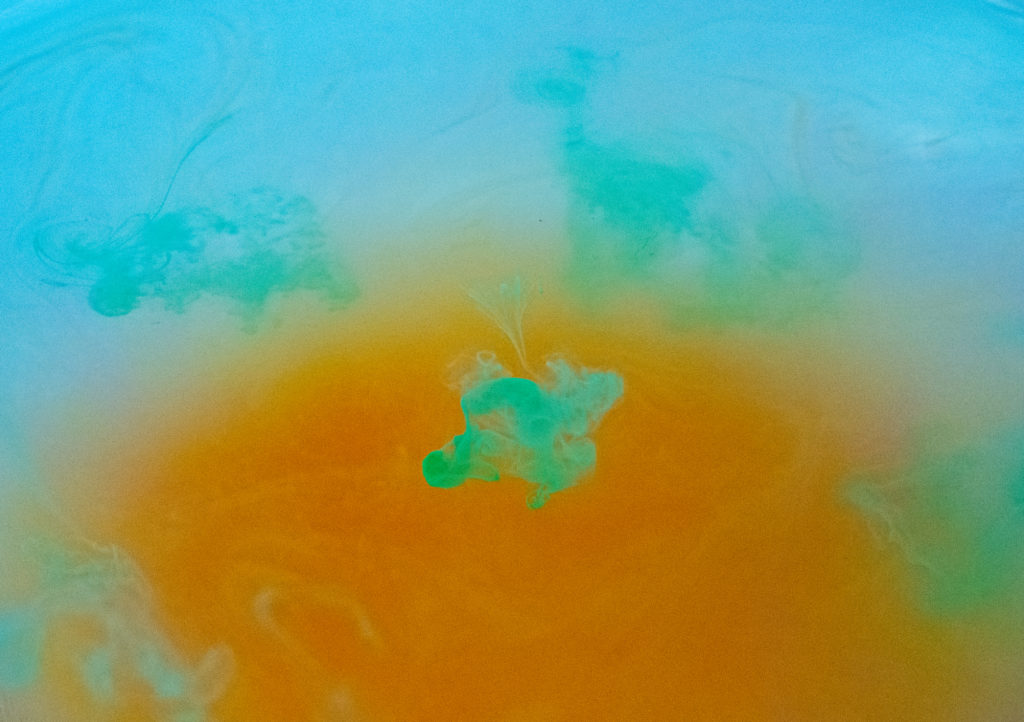

This is an image I took while dropping watercolor pigment into a bowl of water. This image was after I had dropped in several colors already but I also edited the image in photoshop and changed the white balance setting to changes the hues and intensity of the colors.
IV 2 Report: https://www.flowvis.org/wp-content/uploads/2020/11/IV-2-Report.docx
11 Comments. Leave new
Great Vibrant Colors. I like the center focal point because it really produces an interesting image.
I like how you were able to visualize vortices with such interesting colors.
The electric contrast between the colors in this image really demonstrates the flow of the watercolor in the water.
I think you chose awesome colors! They have great contrast, and compliment each other well.
I really like the color editing. It really makes the flow stand out and makes the colors very beautiful.
I really like the colors, the teal and orange aesthetic is super nice. It’s actually a somewhat common color theory choice in movies (like fight club)!
Beautiful image! Very vibrant colors. Really interesting fluid mechanics going on here.
I love the colors on this image, it creates a wonderful contrast, while still focusing on the flow primarily.
I love how bright the green is in the middle. The colors really pop.
I really like the complimentary colors you used here. That blue in the center of the yellow makes a great focal point. That flow right above the focal point then glides your eye to scan the whole image.
I love the color selection in your image. The colors are really vibrant and really make your image pop.